
Case study · 2023 – 2024
Already known. Already in.
Nexa is a youth banking app for 18 to 30 year olds, built as a new brand on a large bank's infrastructure. I designed the way in: a fast track for people the bank already knows, onboarding in English and Arabic for everyone else, and the home, dashboard and savings goals they land on.
Scope of work
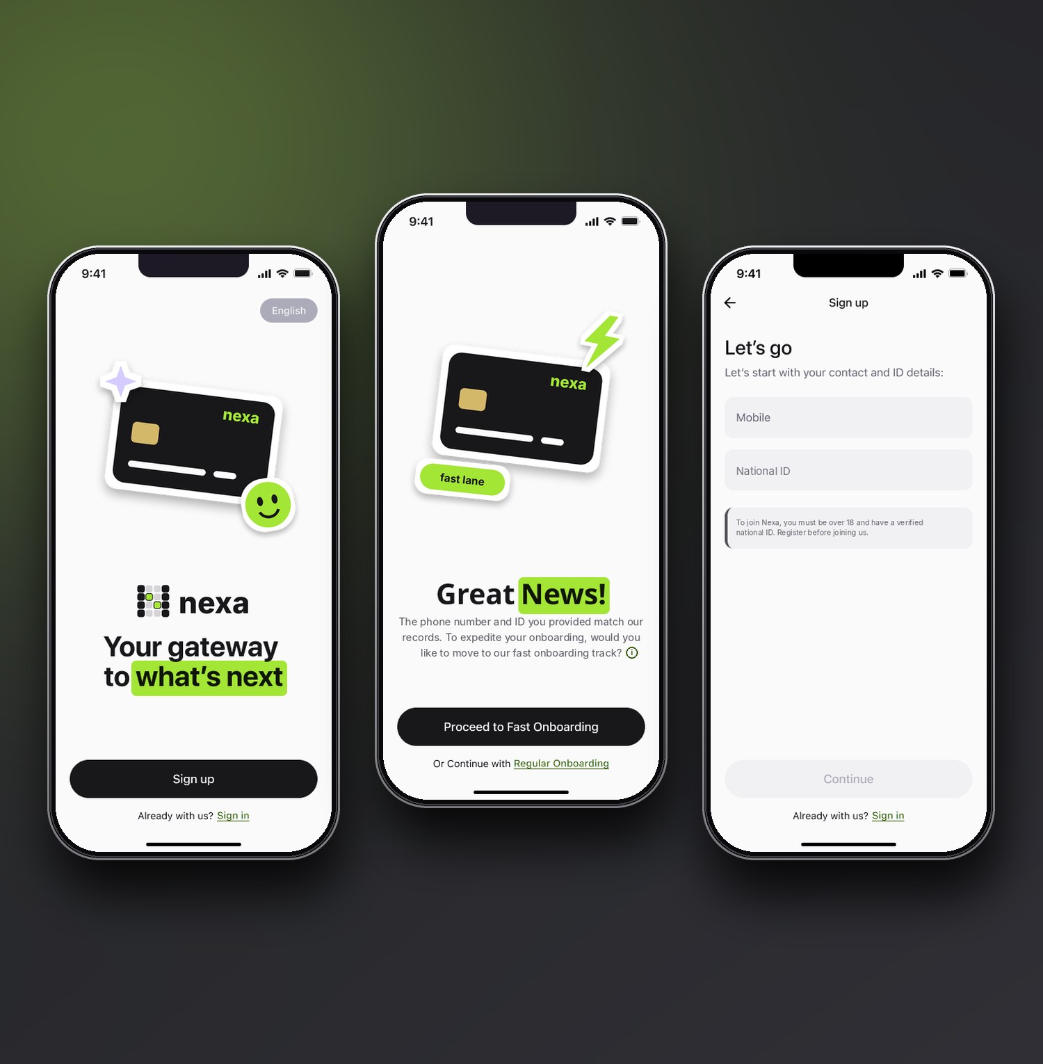
A welcome, a language switch, and two fields to start.
Onboarding for a youth bank, in two languages
Nexa is a youth banking app for 18 to 30 year olds, built as a new brand on a large bank's infrastructure. I designed the way in: onboarding in English and Arabic with a fast track, then the home and dashboard people land on, and the brand mark that doubles as the loader.
I was a UX Designer at Ejada, in one of six agile squads next to two business analysts and two front-end developers, with a lead UX designer across squads. I designed and handed over journeys in two-week cycles to the client's product owner, and the app is live.
The short version
- The problemOpening a bank account means handing over identity, contact, financial and tax details. Every field is a place to quit, and for a 20-year-old choosing between apps, the first five minutes decide whether the account is ever used.
- What I didDesigned an onboarding that asks for two things to start, checks the rest behind the scenes, and offers a fast track to people the bank already knows. Then designed the home and dashboard they arrive on.
- What changedPeople confirm details instead of typing them, returning customers skip screens, every failure says what to do next, and the whole journey works in English and Arabic.
The challenge
A regulated bank has to verify people against existing records and national identity checks, so onboarding could not be one short form. Different people needed different paths, and each path had to feel as light as the shortest one.
- Collect everything the bank is required to collect, without it feeling like paperwork.
- Route people by what the bank already knows about them.
- Work in English and Arabic, with the same quality in both.
- Give the app an identity that feels like it belongs to 18 to 30 year olds, not to a branch.
My role and the scale of the work
I was a mid-level UX Designer at Ejada for about a year. Each squad ran two-week cycles and ended them with a handover meeting with the client's product owner. I owned the onboarding journey and the home and dashboard screens.
Research: who it is for and what already works
I worked inside a delivery squad, so my research was desk-based and led by the requirements, not a field study. It shaped the first screens, and talking to young customers directly would be the next step.
What the brief told me
The audience
Young adults opening what is often their first account of their own, on the phone they already hold.
The rules
Customers must be over 18 and have a verified national ID. Those rules decide who can join, so they must be clear before anyone types.
The promise
Open an account without visiting a branch, in English or Arabic, and be able to use it straight away.
Three people I designed for
These are working profiles built from the brief and the requirements, not interview data. They kept the team honest about who each screen was for.
The first-time account holder
Just turned 18 and phone first. Needs few fields, plain words and a clear sense of how long it will take. Risks quitting at the first form that feels like paperwork.
The existing customer
Already banks with the group. Needs not to repeat what the bank already knows, and a quick way in. Risks being treated as a stranger, or sent to the wrong flow.
The Arabic-first user
Reads and types right to left. Needs an Arabic experience as polished as the English one, with the language switch visible from the first screen. Risks a mirrored version that feels like an afterthought.
What good onboarding looks like elsewhere
I looked at how leading digital banks open an account and listed the patterns that repeat.
| Pattern | What digital banks tend to do | What I took for Nexa |
|---|---|---|
| Short start | Ask for one or two things first and build the profile step by step. | Sign-up asks only for a mobile number and an ID number. |
| Visible progress | Show how many steps are left, so effort feels bounded. | A progress bar on every regular-onboarding step. |
| Reasons for sensitive questions | Explain briefly why income or tax residency is needed. | An expandable "why we ask" next to each sensitive field. |
| Verification | Check identity with documents or a selfie, which adds friction. | Use records the bank already holds, and ask the person to confirm. |
| Language | Often an English-first flow with other languages added later. | English and Arabic designed side by side from the first screen. |
What I took from it
- Ask for the minimum, then use what the bank already knows.
- Show where the person is, so the form never feels endless.
- Explain every sensitive question in one tap, not in a wall of text.
- Treat both languages as first-class, from the first frame.
How I worked
Each squad worked from business-analyst requirements written as numbered stories with acceptance criteria. Every screen in my files carries its story number, so any design can be traced back to the requirement behind it, and every state a story describes (default, completed, error, time limit) got its own frame.
My loop was to read the story, map the decision logic, design the happy path and its states, then walk it through with the analysts and developers before the handover meeting. Mapping the logic first mattered most here, because onboarding is mostly decisions.
The logic behind two fields
Sign-up asks for a mobile number and an ID number, and nothing else. What happens next depends on five checks, run in order. I drew the logic as a flow before drawing a single screen, because every branch needed its own screen and its own words.
- Existing customers are sent to sign in with a short, friendly banner, not an error.
- People the bank already knows and who pass every check are offered the fast track.
- A number mismatch gets its own screen: use the number the bank has, or continue the regular way.
- Everyone else lands in regular onboarding with nothing lost, and no judgment.
From research to wireframes
I wireframed in grey so that structure, not colour, drove each decision. Every screen went through rounds, and below is what changed and why. These rounds are my own critique against the research and the stories. Testing with young customers would come next.
Sign-up
The fast-track offer
Confirm your details
When the number does not match: three options
Grey boxes are placeholders. Highlighted areas show what changed or what I chose in each round.
Try the onboarding journey
This prototype links the real screens, in the order a customer meets them. Tap the real buttons and fields on each screen, as the guide beside the phone suggests. Use the extra buttons to branch into the age rule, an existing customer, the fast-track explanation, the regular route, a missing ID detail and an invalid email.
The fields are filled with sample data, and the long screens scroll inside the phone.
Welcome
The way in
Three screens set the tone: a welcome, two fields, and a choice.
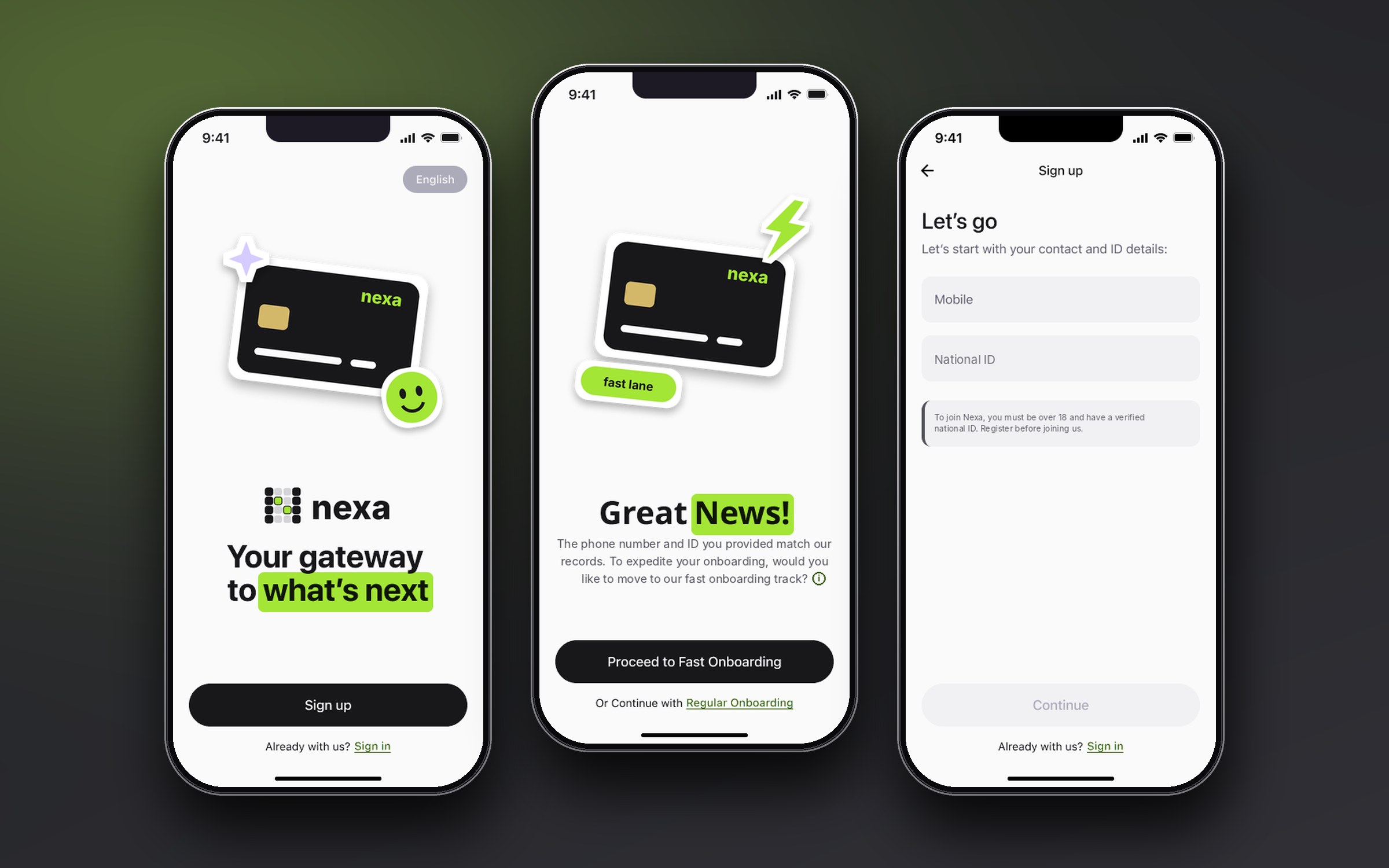
A welcome with a language switch
The first screen is one illustration, one line and one button, with the language switch in the corner. Arabic and English speakers start in their own language from the first tap.
Two fields, then a decision
Mobile and ID, a short note on who can join, and a disabled Continue that wakes up when both are valid. Everything else waits until we know which path the person is on.
The fast track
When the details match, the next screen says so plainly and offers a faster route. The person chooses, and a short explanation says what the fast track means before they commit. Returning customers skip the screens that would ask for what the bank already knows.
Confirm, don't type
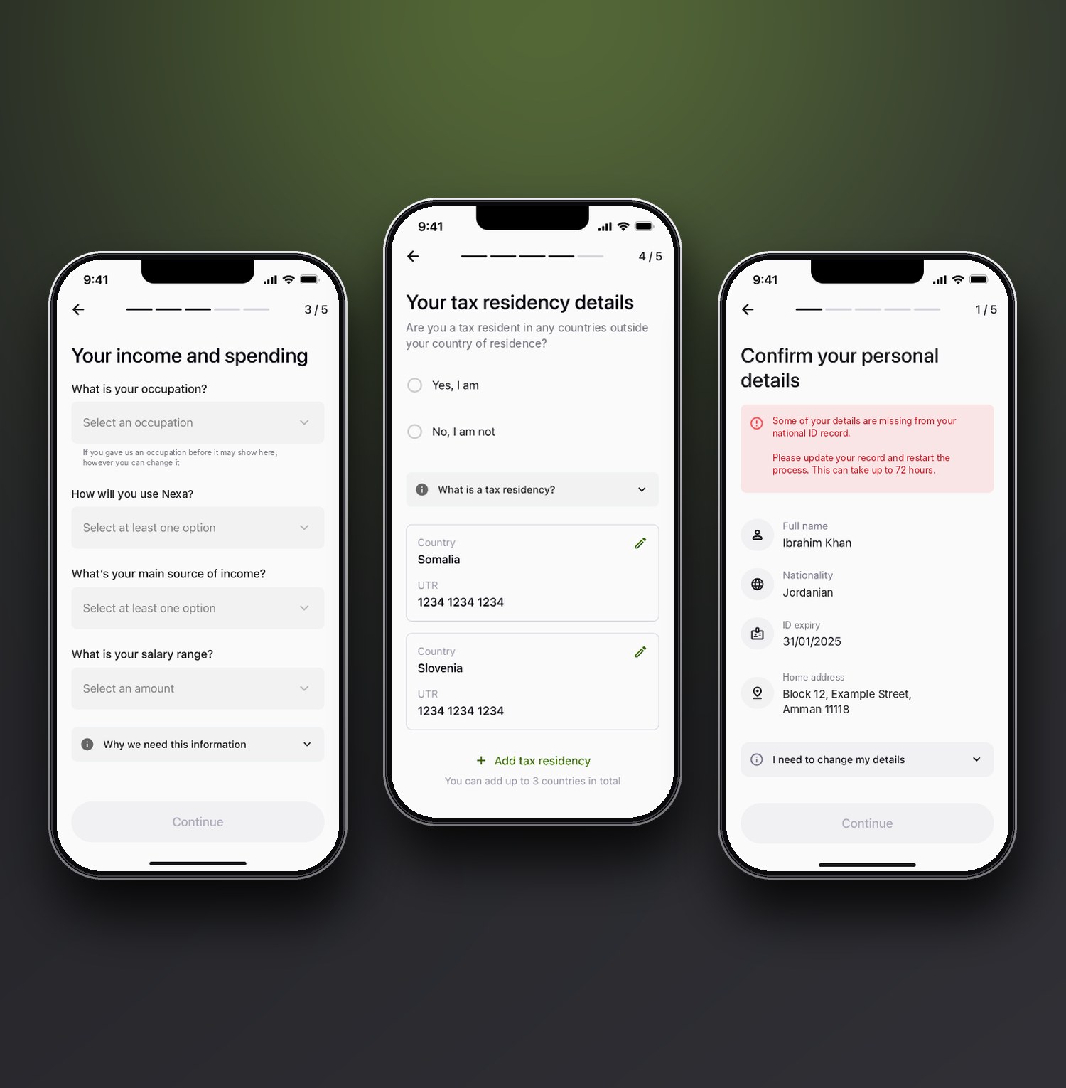
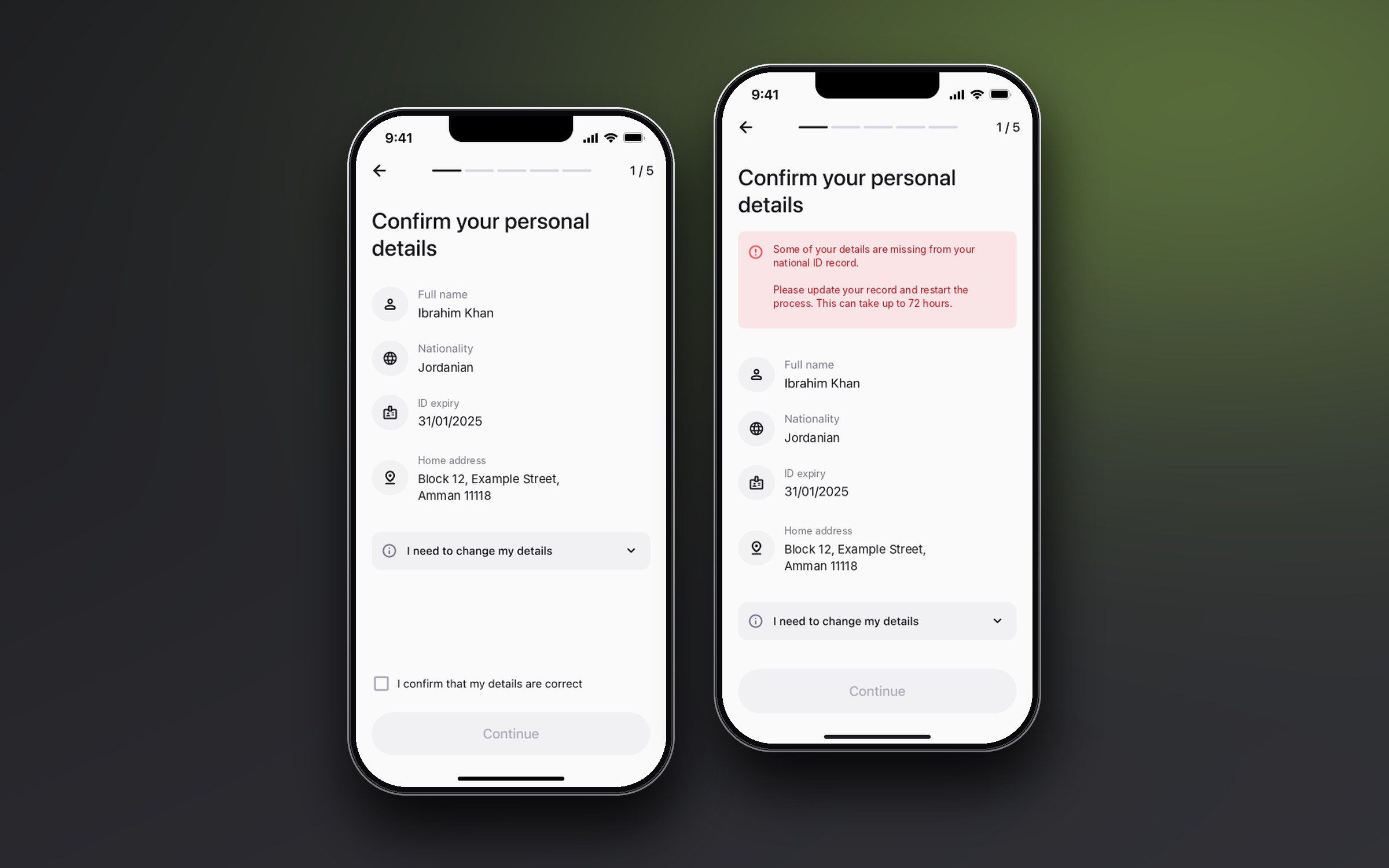
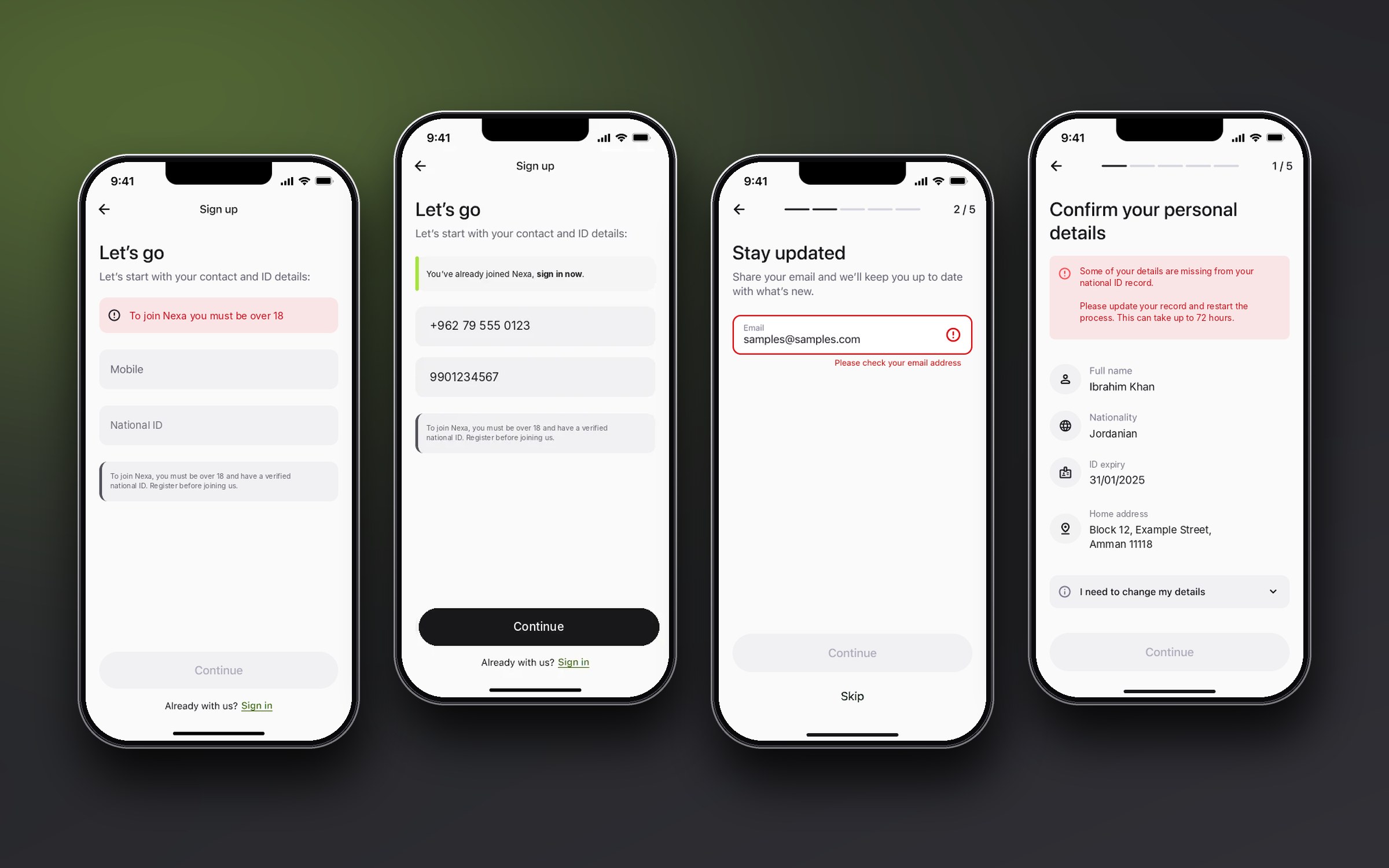
On the regular path, name, nationality, ID expiry and address arrive pre-filled from the identity check. The person reviews them and confirms with one checkbox. People check, they do not type. When the record is incomplete, the screen says what is missing, where to fix it, and that updates can take up to 72 hours, so the person can leave and come back.
The rest follows the same rule. Email is framed as "stay updated" with a Skip button, so it never blocks the journey. The financial questions use dropdowns with an expandable reason for asking, and tax residency lets a person add up to three countries as editable cards, with the limit stated before they reach it.
When it goes wrong, and the last steps
Most of the frames in the file are not the happy path. An under-age sign-up, an existing customer, a mistyped email, an incomplete record: each is a real screen with its own words. Errors name the field, say what to do, and never blame the person, and they look the same everywhere so people learn them once.
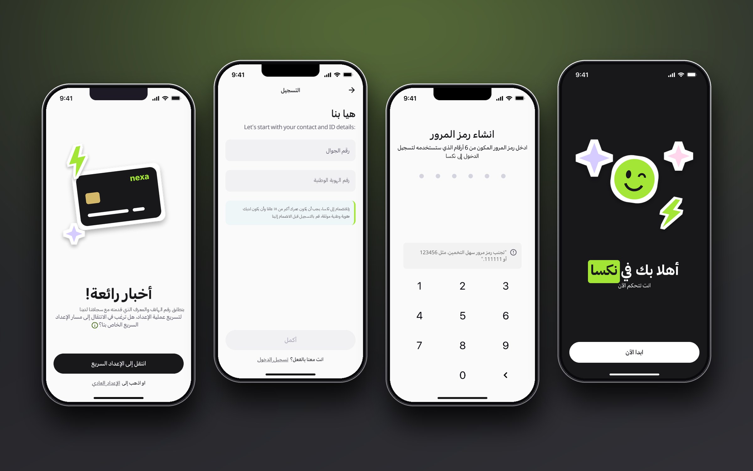
The ending is plain on purpose. Terms are a single checkbox in plain language, the passcode screen blocks obvious choices and says why in one line, and the account-created screen flips to a dark theme so the finish feels different from the paperwork before it.
Built for right-to-left, not flipped
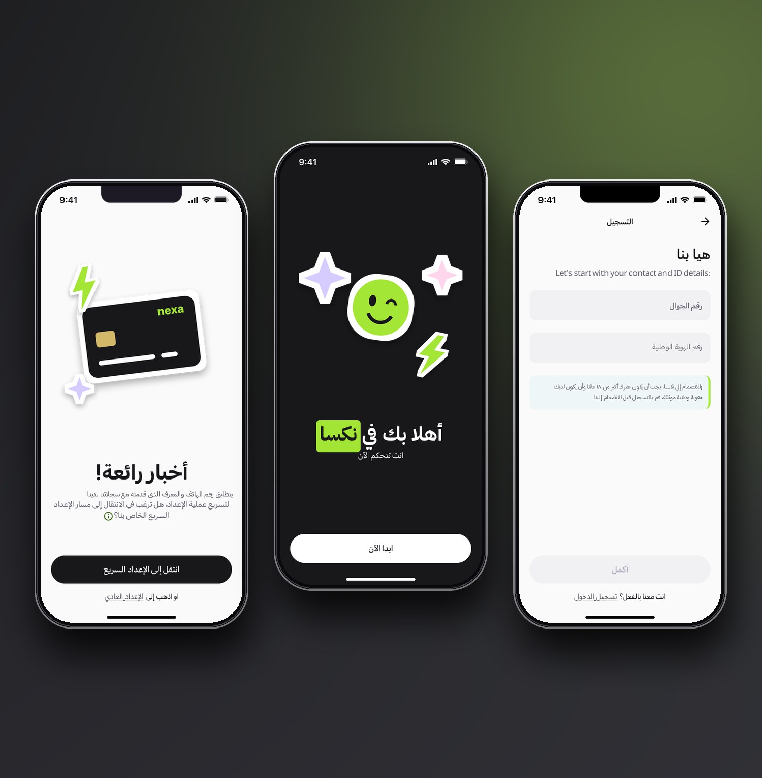
Every screen exists in English and Arabic. Arabic is not a mirror image: icons that imply direction flip, back arrows move to the right, progress runs the other way, and numbers, phone numbers and codes keep their left-to-right order inside right-to-left text. Arabic copy is written for the screen, not translated word for word, so it fits the same components without breaking layouts.
After onboarding: home and dashboard
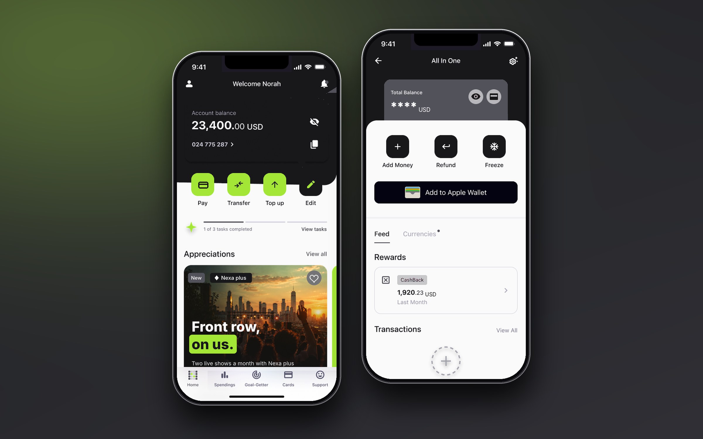
The home screen answers the first question a person has: how much do I have? The balance sits in a card with a hide toggle, so it is safe to open on a train. Four large actions (Pay, Transfer, Top up and Edit) sit within thumb reach. A thin progress strip, "1 of 3 tasks completed", keeps finishing setup gentle, and the Appreciations carousel puts rewards where people already scroll.
The dashboard gathers the card in one place: add money, refund, freeze, add to the phone wallet, then rewards and transactions. A first-time person sees a friendly empty state, not a blank list.
Savings goals, redesigned
The shipped goal screen did the basics: a progress ring, the amount, the target date and two actions. Looking back, it felt like any banking app, and it never said whether you were on track. This is my portfolio redesign of that screen, not the live version.
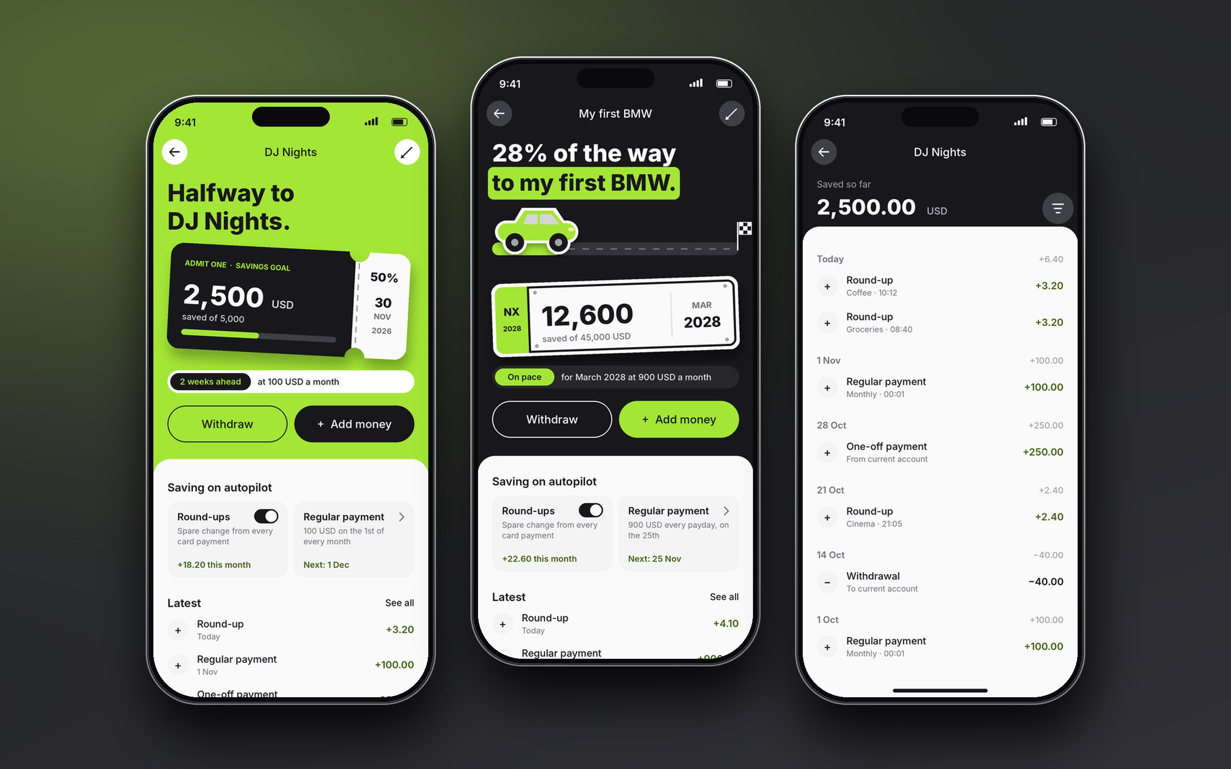
The goal now reads as a ticket to the thing you are saving for: "Halfway to DJ Nights", the amount saved on the stub, the target date and percentage on the tear-off. Under it, a pace chip answers the question people actually have: "2 weeks ahead, at 100 USD a month". Round-ups and the regular payment became cards that show what they did this month, and the latest activity adds up to the balance.
Each goal gets its own object. Saving for a first car becomes a road with a finish flag and a number plate that carries the balance, on graphite instead of lime. The layout underneath never changes, so a second goal feels new without teaching anything new.
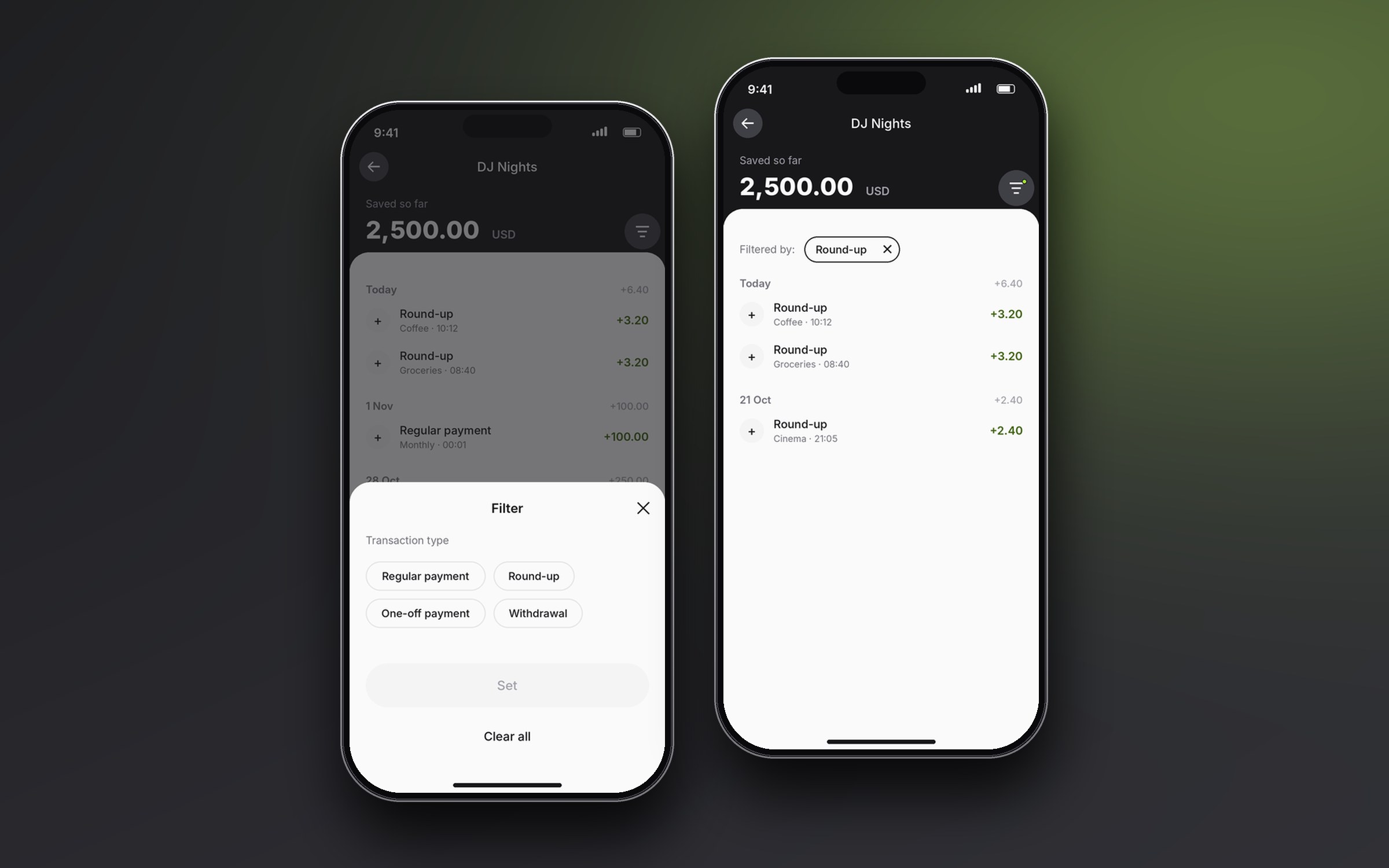
Transactions you can scan and filter
The list groups transactions by day and shows each day's total, so a long history is easy to scan. The filter sheet narrows it by type: regular payment, round-up, one-off payment or withdrawal, and Set stays off until something is chosen. Chosen filters stay above the list as a chip that can be removed, so it is always clear why the list is shorter, and one tap brings everything back.
Control and trust: who can see my data
Open banking lets other companies read a person's account data, so the app needs a place where they can see who has access and take it back. It sits in App settings under Account, next to Passcode, Biometrics and Device management, so it reads as security and not as a marketing feature.
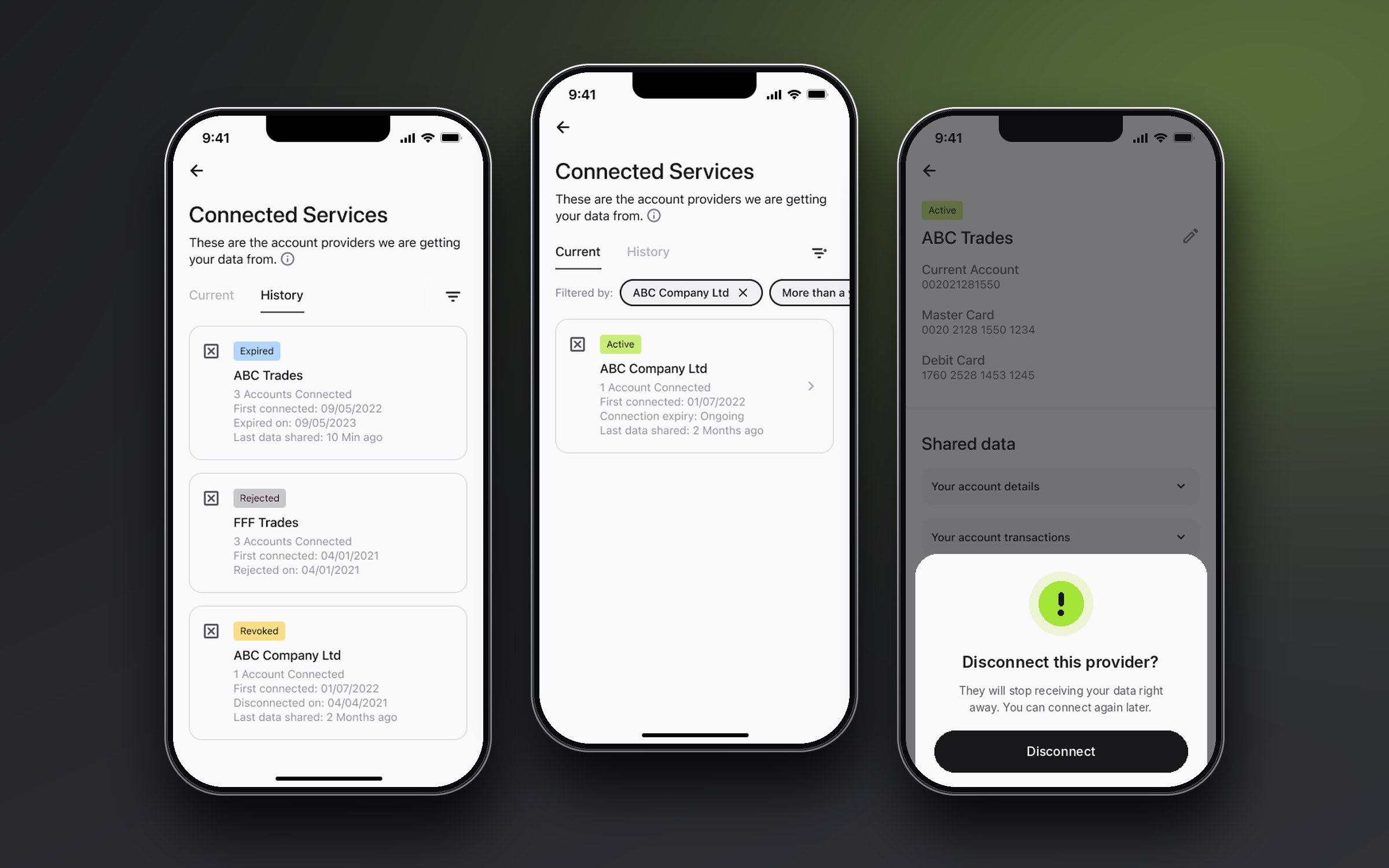
Connected Services opens with one sentence: these are the providers we are getting your data from. Current and History are separate tabs. Each provider is a card with its status, accounts connected, first connected, expiry and when data was last shared. In History, Expired, Rejected and Revoked each get their own colour and wording, so a person can tell what ended the connection without opening it.
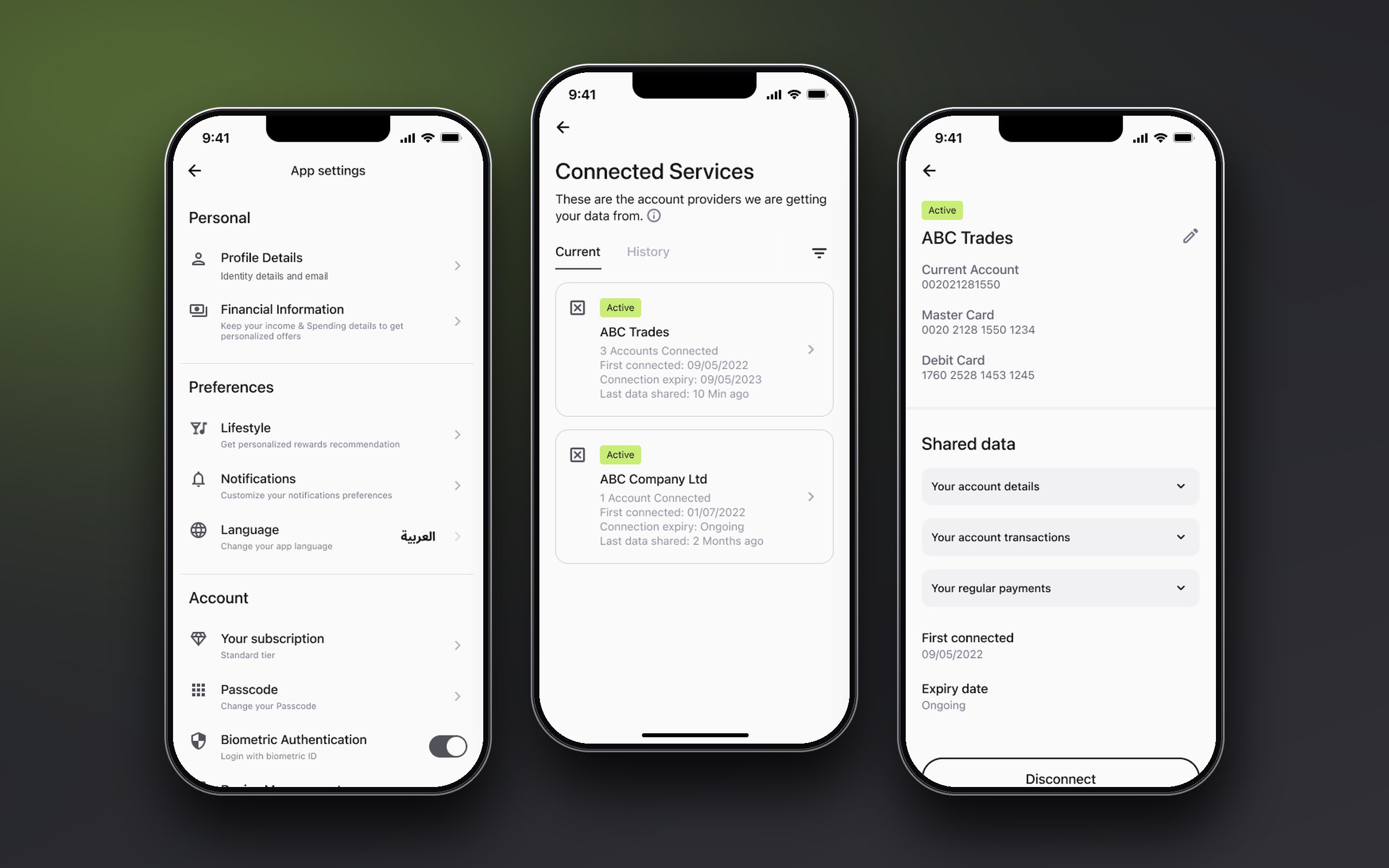
Detail is grouped in plain language: account details, transactions, regular payments, each in an accordion, with the dates at the bottom. Disconnect is an outlined button, not a red one, but it always asks first. The confirmation says that sharing will stop right away and that the person can connect again later, so the choice never feels like a trap. A filter by provider and date keeps the list usable when there are many connections.
A brand mark that is also the loader
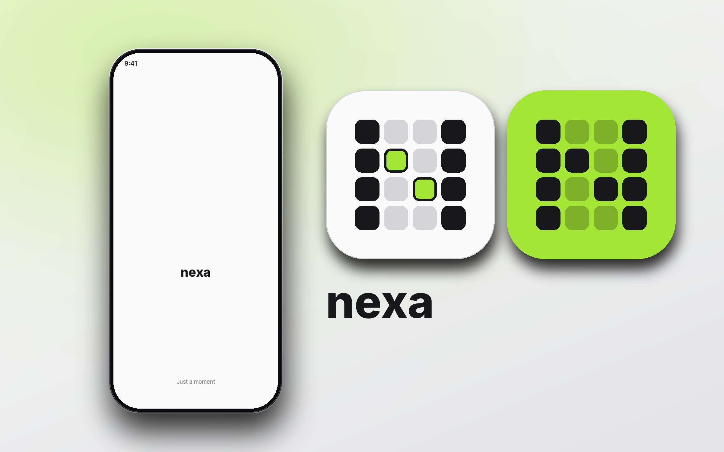
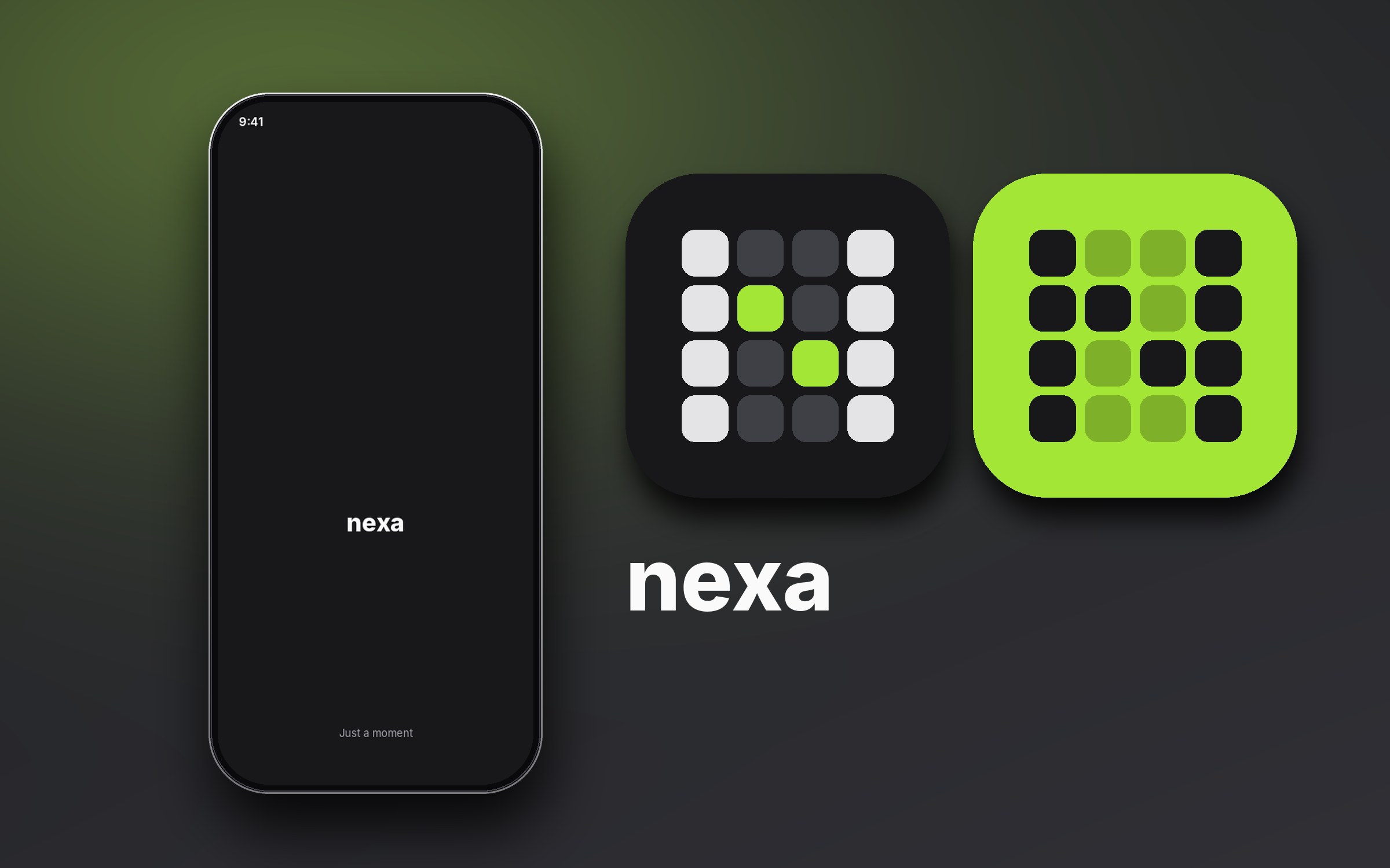
To keep the client under wraps I gave the case study its own brand: Nexa. The app already used its logo as a loading animation, so I designed the mark to do both jobs: it animates while the app loads, and the finished frame is the app icon. In the prototype above it opens the app and covers the wait while the sign-up checks run.
Design decisions
Ask less, confirm more
Pre-fill from verified sources and ask for a check, not an entry. Every field removed is one less place to quit.
Offer the shortcut, don't impose it
The fast track is a choice with an explanation. People who want the regular path can take it.
Say why we ask
Expandable explanations sit beside the sensitive questions, so the regulatory reason is one tap away and out of the way.
Design the failure
Every check that can fail has a screen that says what happens next, so a failed check is a pause, not a dead end.
Two languages from day one
English and Arabic frames were built side by side, so mirroring and text length were solved in the components.
One mark, two jobs
The logo is the loader. People see it dozens of times, so it carries the brand without a splash screen.
Leading and collaborating
Six squads shared one product, so part of my job was making sure everyone built from the same understanding. I presented finished journeys at the handover meetings with the client's product owner.
Working across disciplines
Every day with two business analysts on requirements and two front-end developers on how designs become code.
Aligned with five other squads
I stayed in step with the other squads through the lead UX designer, and flagged gaps instead of inventing one-offs.
One component library
I built onboarding from the shared library (inputs, banners, accordions, bottom actions, radio cards) and used the same pattern for errors on every screen.
Outcome
The onboarding shipped in the live app. The client has not shared conversion data, so I will not claim figures. What I can show is what the work delivered:
- A complete, traceable journey: every requirement maps to a screen, and every state a requirement describes has a frame.
- A fast track that removes screens for returning customers.
- Full English and Arabic coverage, designed together.
- Error and edge states designed up front, not left to development.
- A home, a dashboard and a brand mark that carry the same tone from the first tap.
What I would do differently
- Prototype the logic earlier. The five-check flow was clear on paper, and the prototype above shows how well it reads once it is clickable. Building it before the screens were final would have let the analysts and the product owner test the branches sooner.
- Test the fast-track copy. It is the most important line in the journey, and I would test two or three versions with people aged 18 to 30.
- Keep an Arabic checklist. A short list (direction, numerals, mixed-language lines, truncation) would catch the small misses that appear when two languages ship together.
More Projects
Like what you see?Let's discuss your next project.
Chat on WhatsApp (opens in a new tab)