
Case study · RFP · 2025
Designing one app for every SABCO radio brand
SABCO Media runs several radio brands in Oman, each with its own app and website. For the RFP I audited what exists, benchmarked the best music and podcast apps, and proposed one unified app where every brand keeps its own identity.
Scope of work
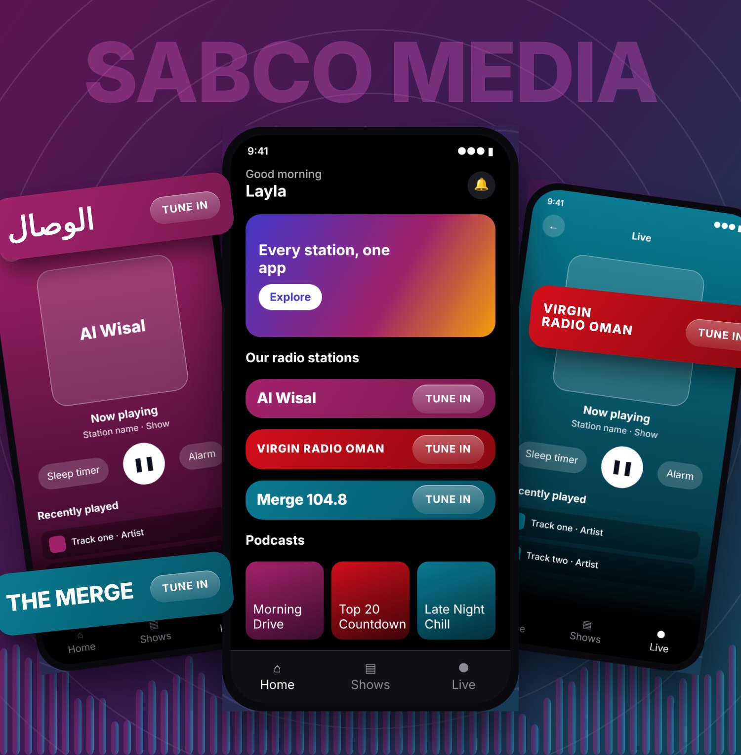
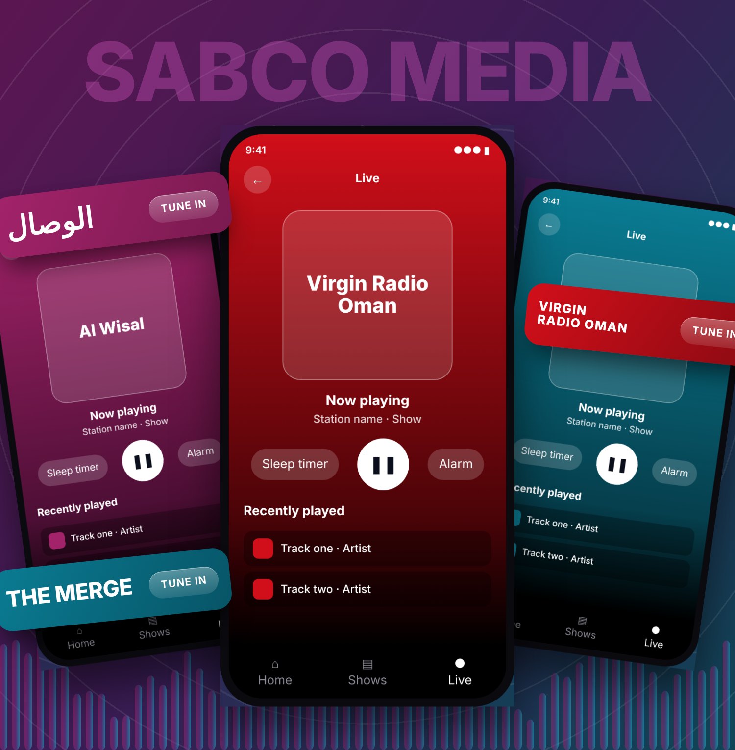
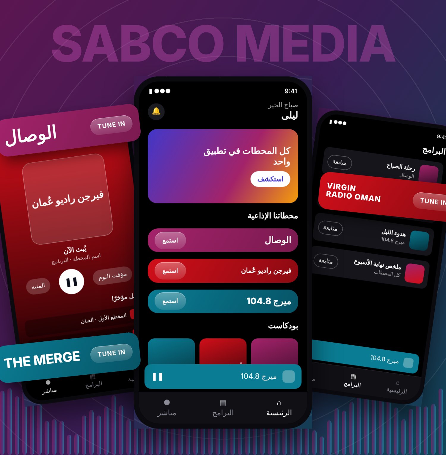
Every station lives in one home, with one player.
Senior UX/UI Designer on the RFP, working with a Lead Designer above me and a junior designer beside me. My work: the audit, the benchmark and the prototype.
Research, ideation, wireframes and a prototype for one app serving three radio brands, in Arabic and English.
Proposal submitted with a clickable prototype. It is an RFP, so there is no live product and no result to report.
The short version
- The problemThree radio brands, three apps and three websites that all work differently. No app has every feature, and a listener has to relearn the app for each station.
- My recommendationOne app and one design system, with a theme for each brand, built and launched one brand at a time.
- WhyThe audit shows the best features are scattered, the benchmark shows what leading apps get right, and a shared system is cheaper to build and easier to grow.
- What I deliveredAudit, feature list, competitor analysis, synthesis, ideation, information architecture, three rounds of wireframes and a clickable bilingual prototype.
- What comes nextMeasure the current apps, test with listeners, then build. The plan, risks and success measures are below.
A media group with a separate app for every station
SABCO Media describes itself as Oman's largest multi-platform media company. Its radio brands include Merge 104.8, Al Wisal and Virgin Radio Oman. Each one has its own app and its own website, and each looks, feels and works differently.
The RFP asked for a better way to serve listeners across these brands. I approached it the way I would a real engagement: understand what exists, learn from the best, then propose a direction that a team can build and grow.
About this caseThis was a proposal. The screens of the existing apps and websites below come from my audit and belong to SABCO Media. The proposed app is my own design, shown as a clickable prototype with sample content. The research steps are my own analysis of the screens I reviewed. No listener interviews were part of the RFP, so anything about users is labelled as a hypothesis.
The challenge
Three strong brands, each with a loyal audience, but a listener who follows more than one has to learn a new app every time.
- Give listeners one place to hear every brand, without flattening what makes each brand different.
- Work in Arabic and English as equals, including right-to-left layouts.
- Create something a small team can build, maintain and extend, one brand at a time.
My role and the scale of the work
I started with the approach before drawing anything: what to review, what to compare against, and which decisions the team would need to make. I worked with a Lead Designer, who set the direction, and a junior designer who worked alongside me.
What I worked on
- The research. The audit, feature list and competitor analysis.
- The thinking. Findings, principles, ideation and the information architecture.
- The wireframes. Three rounds on the key screens.
- The concept and prototype. One app, one design system, a theme for each brand, shown as a clickable prototype.
What success would look like
A media group does not buy an app for its own sake. It needs listening, advertising value and a product it can afford to keep running. SABCO Media promotes advertising on its own corporate site, so protecting ad value is part of the brief, not an afterthought.
| Business goal | What design does | How we would measure it |
|---|---|---|
| Grow listening across brands | Makes it effortless to move between stations | Share of listeners who play more than one station each month |
| Protect advertising value | Keeps ad-friendly placements in the player and home without hurting the listening experience | Listening time per session, and ad placement reach per brand, measured with the ad team |
| Lower the cost of three apps | Builds each part once and themes it per brand | Share of components built once instead of per brand, and time to launch a new brand or feature |
| Make listening easy | Puts live radio one tap from the home screen | Time and taps to first sound, measured in usability tests |
| Spread the best features | Offers the timer, alarm and podcasts to every brand | Feature use per brand after launch |
The solution: one app, many brands
The core idea is simple. Everything that does not need to differ is built once: the player, the navigation, the show pages, search, and the Arabic and English layouts. What differs between brands lives in a theme: colour, logo, imagery and tone.
A listener opens one app, picks a station, and the whole experience takes on that brand's look. The tools that set a timer or follow a show work the same everywhere. Try it below: tap a station, switch to Arabic, and replay the splash screen.
Language
Start
Jump to a station
What this shows
- A splash screen that sets the group brand.
- One home for every station.
- One player, themed per brand.
- Sleep timer and alarm for every station, not just one.
- Arabic and English from one set of components.
Prototype with sample content. Logos are shown as simple wordmarks and nothing plays.
SABCO MEDIA
All our radio, one app
The design system behind it
The single app only works if the system under it is right. I split it into three layers, so a change at the bottom reaches every brand, and a brand change never touches the rest.
Built once, themed by tokens
Colour, logo, imagery and tone per brand
Shared by every brand
How a theme works
A theme swaps a small set of tokens. Components never use a raw colour, so adding a fourth brand means adding one theme, not rebuilding screens.
| Token | Merge 104.8 | Al Wisal | Virgin Radio Oman |
|---|---|---|---|
| Primary | #0A7C93 | #A3236A | #D10F1A |
| Dark variant | #075466 | #7A1A50 | #8B0A12 |
| Text on primary | White | White | White |
| Logo and artwork | Brand-supplied | Brand-supplied | Brand-supplied |
One thing the audit taught me
Merge's bright teal looks great on screen, but white text on it is hard to read. I measured it at about 2.4 to 1, below the 4.5 to 1 minimum for body text. So every theme has a text-safe primary, and the prototype uses a slightly deeper teal. Each brand's colours get that check before they enter the system.
How it stays healthy
- Two-brand rule. A component joins the shared layer only if at least two brands need it.
- Review before release. New components are checked against the design principles and reviewed with the Lead Designer.
- Documented. Each component records its states, its tokens and how it mirrors in Arabic.
- One owner per brand theme. Brand owners approve their own theme, and nothing else.
Design decisions
One app, brand as a theme
Listeners should not install three apps to hear three stations. Building once and theming per brand keeps each identity and removes the duplicated work.
Arabic and English as equals
Right-to-left is designed in from the first component, so mirroring is solved once in the system and not patched per screen.
Player first, always reachable
Listening is the job. A persistent mini player, the pattern I saw work in the benchmark, keeps playback in reach while people browse.
App and web from one system
The same components and tokens serve the app and the websites, so a listener meets one brand family on every screen.
Bring the best features to everyone
The alarm and sleep timer, podcasts and articles, news and shows each live in one app today. In one system they can be offered to every brand, switched on where they fit.
Launch one brand at a time
Starting with a single brand lets the team learn, fix and improve the system before the others move across.
Constraints, risks and trade-offs
A good proposal names what could go wrong. These are the main risks I would raise with SABCO, and how the design responds. Items marked as assumptions would be confirmed in discovery.
| Risk | Why it matters | How I would respond |
|---|---|---|
| Brand owners resist sharing | Each brand has a loyal audience and a strong identity | Run workshops early, show what stays unique, and let each owner approve their own theme |
| Advertising must keep working | Advertising is core to the business | Design ad placements into the home and player from the start, and test them with the ad team |
| Content comes from separate sources | News, shows and articles likely live in different systems (assumption) | Agree a simple content model with engineering before building screens |
| Listeners are used to their app | Changing a familiar app can upset loyal users | Launch one brand first, keep the old app running, and move listeners across when the new one matches it |
| Arabic done as an afterthought | A flipped layout feels wrong to Arabic readers | Design both directions together and review every screen in Arabic first |
| Scope creep | Downloads, a personal feed and voice search are tempting | Hold the first release to the high-impact, low-effort set |
What I would cut or delay
- Offline downloads. Valuable, but a large build. Later.
- A personal feed. It needs listening data and an owner for it. Later.
- Voice search. Low reach for the effort. Later.
- Station chat in the first release. It exists in two apps today, so I would plan it as a phase two feature.
What I chose not to do
I did not propose one shared look for all brands, even though it would be simpler. It would erase what makes each station recognisable, and the brand owners would be right to push back.
How I would test it
Everything about users in this case is still a hypothesis, so testing comes next. Here is the plan I would run before any build starts.
What I want to learn
- Do listeners of one station also listen to the others, and how do they switch today?
- Which of the missing features, such as the timer, alarm and podcasts, do they actually want?
- Does the unified home make each brand feel more or less like itself?
How
- Interviews with listeners of each brand, in Arabic and English, to test the three hypotheses.
- Usability tests of the prototype on a phone, with a small group per brand.
- Analytics review of the current apps, to set baselines for the success measures.
| Task | What success looks like | If it fails |
|---|---|---|
| Start listening to a chosen station | Done in one or two taps, without help | Rework the home screen |
| Set a sleep timer | Most people find it without help | Move it up in the player or label it better |
| Follow a show | Most people find and use the Follow button | Strengthen the primary action on the show page |
| Switch to Arabic and carry on | Nothing looks broken or flipped wrongly | Fix the component, not the screen |
Working with the team
On this RFP I was a Senior UX/UI Designer. A Lead Designer set the direction and a junior designer worked with me. A multi-brand product succeeds or fails on alignment, so this is how I would work with everyone involved.
- How I work with a Lead DesignerI bring options with evidence, not only opinions. The audit and benchmark act as a shared reference, so a debate about taste becomes a decision about what the data shows.
- How I work with a junior designerI split the work into clear parts, such as capturing screens and drawing wireframe rounds, and I give feedback against the design principles so they learn the reasoning, not only the fix.
- Brand ownersAgree early what is shared and what stays unique, so each brand sees its identity protected inside the system.
- EngineeringShape the components and tokens together, so what I design maps cleanly to what gets built.
- Content and sales teamsPlan where shows, news and advertising appear, since the media business depends on them.
The research and design process, step by stepNine steps: audit, competitor analysis, ideation, information architecture and wireframes
Step 1: audit what exists
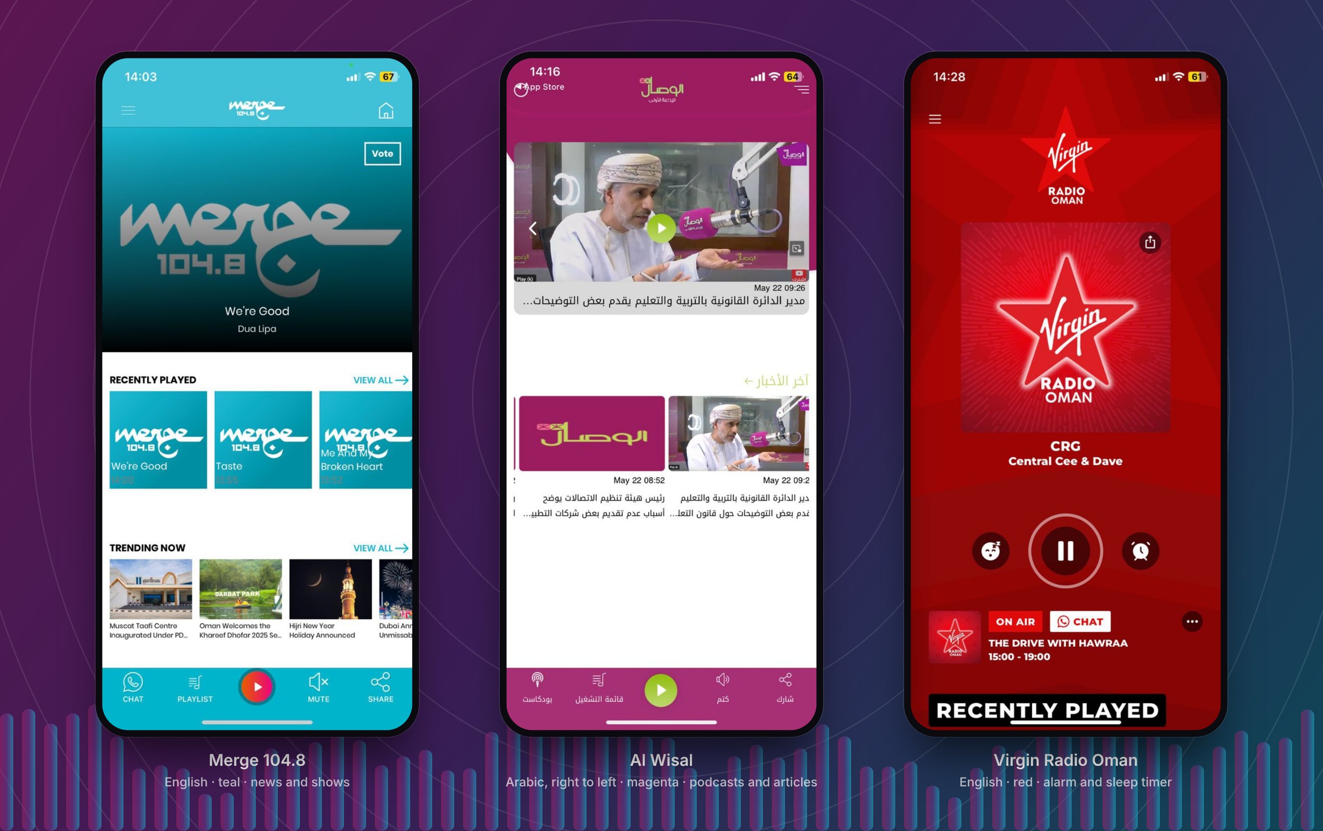
I captured the screens of each app and organised them in one file, so the three could be compared screen by screen: home, playlists, navigation, news, shows and the rest.
All three do the same core job, playing live radio. They just do it in three different ways.
What I found
- Three home screensMerge opens on the station artwork with recently played and trending. Al Wisal opens on video and news cards. Virgin opens on a full-screen player.
- Three control layoutsMerge and Al Wisal keep controls in a bottom bar, but with different items. Virgin puts them in the middle of a full-screen player.
- Features split across appsThe alarm and sleep timer exist only in Virgin. Podcasts, articles and login exist only in Al Wisal. News and shows appear in two of the three. No app has everything a listener might want.
- One direction of readingAl Wisal is right to left, the other two are left to right, so a shared system has to mirror cleanly.
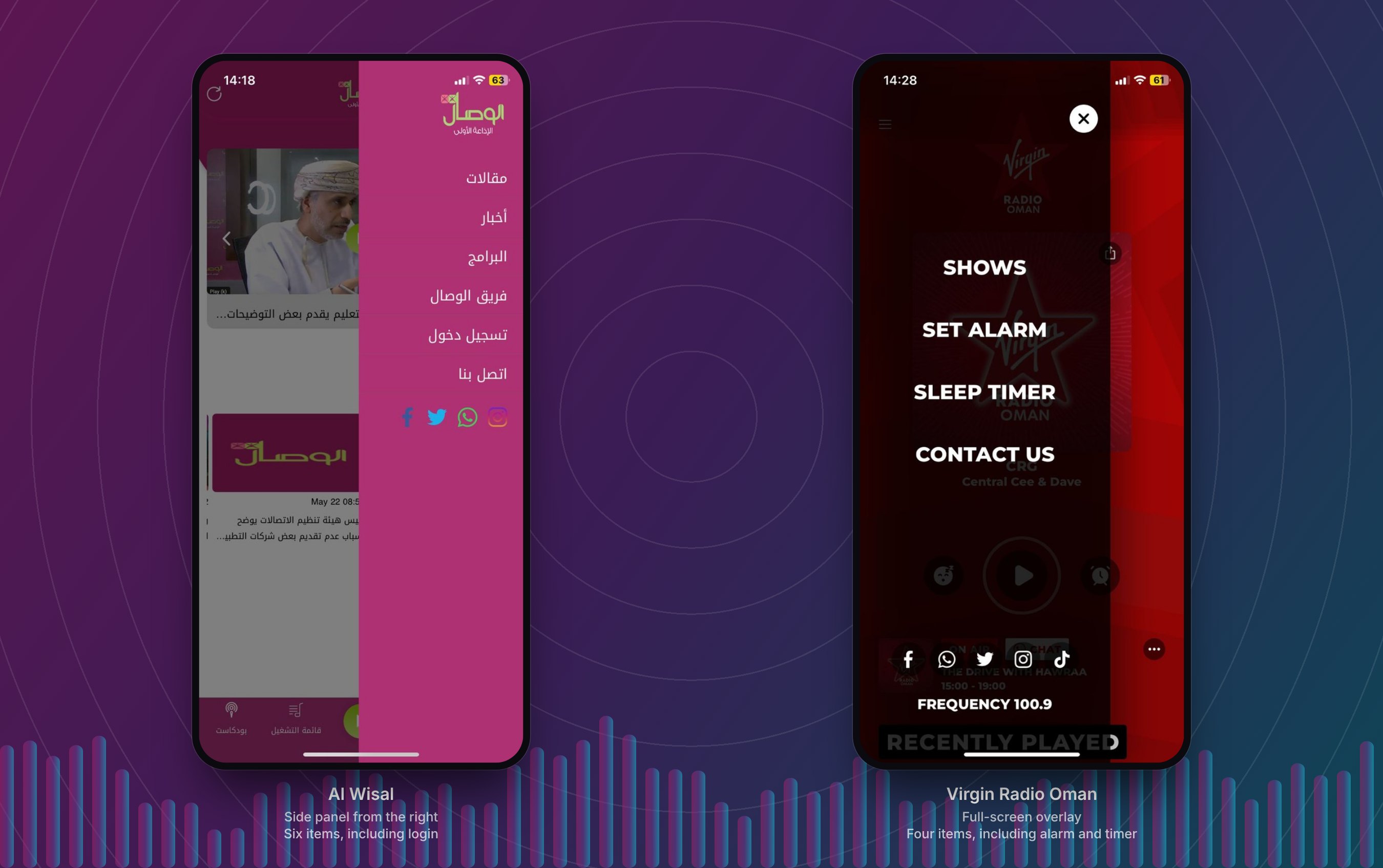
Navigation shows the gap clearly. A listener who opens the menu in one app finds a different structure, different labels and different tools in the next.
Step 2: review the websites
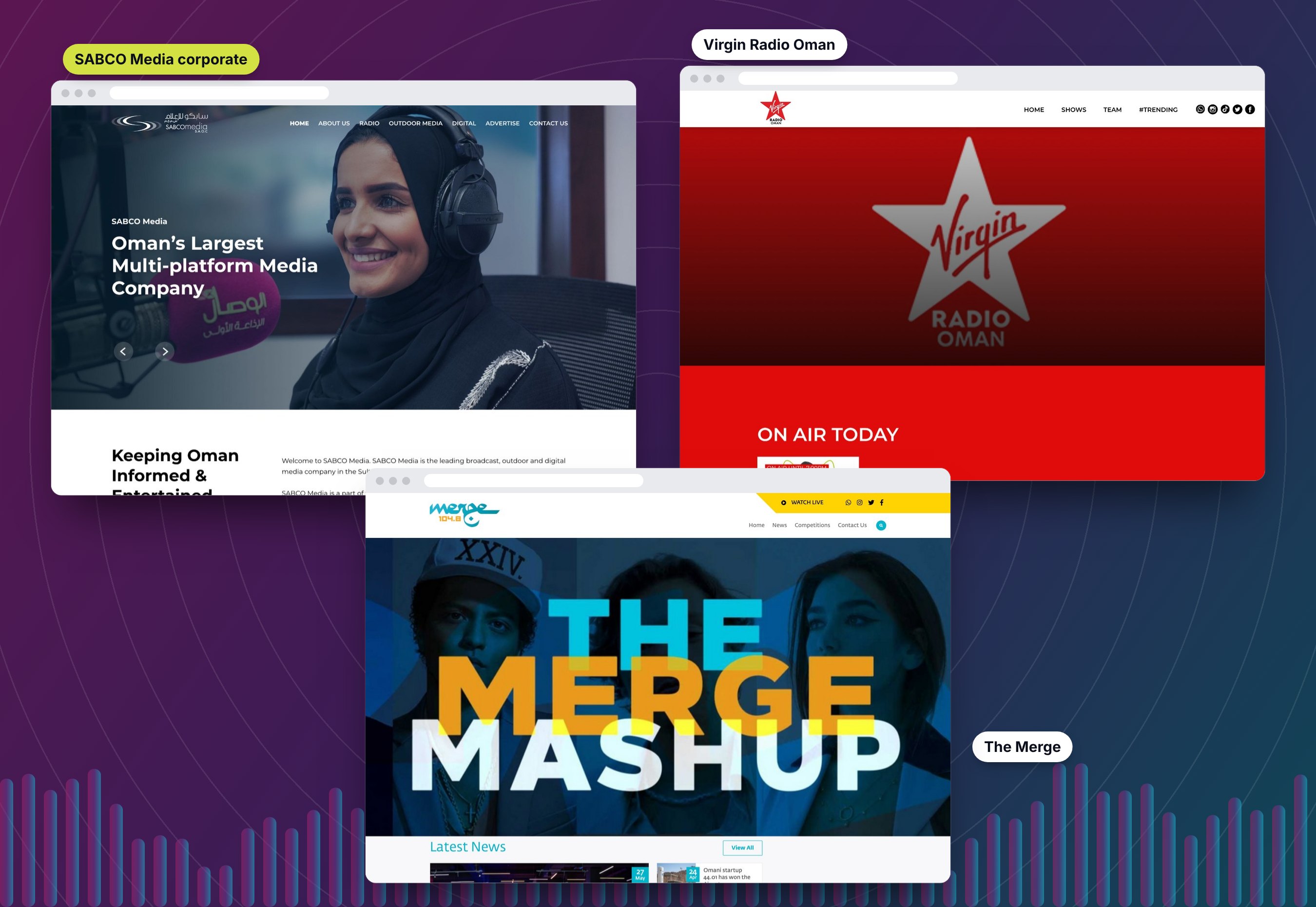
The websites repeat the pattern. The corporate site presents the group, and the two station sites each follow their own layout, navigation and style.
- The corporate site is a dark, image-led page with seven top-level items, from Radio and Outdoor Media to Advertise.
- Virgin Radio Oman is a red, bold page built around what is on air today.
- The Merge leads with campaign artwork and a yellow Watch Live bar.
For a listener the website is often the first stop, so the app and the web should feel like the same brand family.
Step 3: learn from the best
Before proposing anything, I benchmarked Anghami, with Spotify as a second reference. Anghami is the closer match: it serves Arabic and English content in one app and handles podcasts alongside music.
What I took from it
- A mini player that staysPlayback sits above a four-tab bar on every screen, so listening never gets lost while browsing.
- One clear primary actionOn a show page, Play is the filled button and Follow is the quiet one. People know what to do first.
- Prompts at the right momentA "keep up with new episodes" card appears on the show page, where following makes sense.
- Mixed languages in one listArabic and English titles sit together comfortably, which is exactly what a multi-brand SABCO app needs.
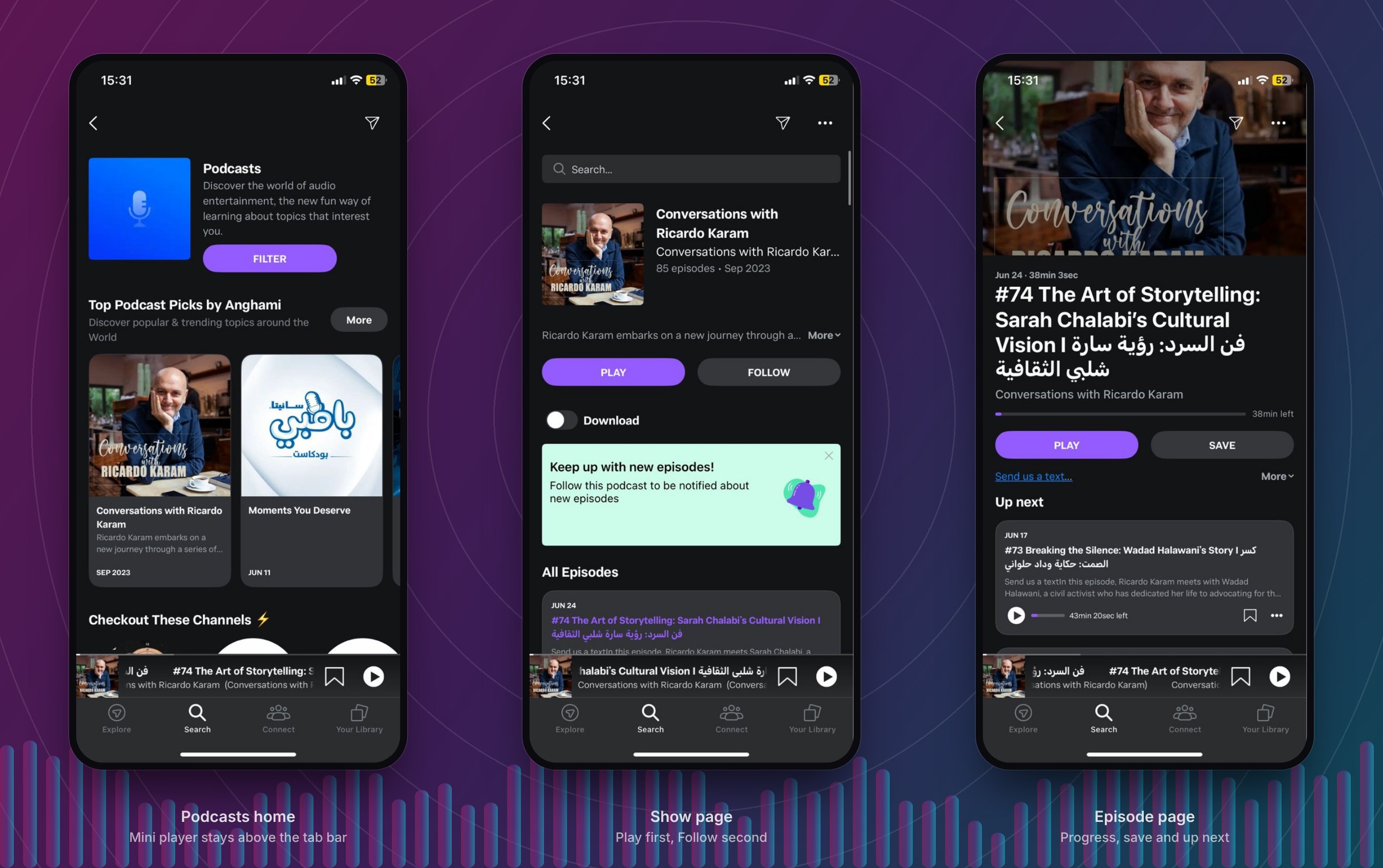
Anghami screens are shown for reference only and belong to Anghami.
Step 4: list every feature
With the screens side by side, I listed every feature I could see and marked which app has it. This turns "they feel different" into something a team can act on.
| Feature | Merge 104.8 | Al Wisal | Virgin | Unified app |
|---|---|---|---|---|
| Live radio player | ● | ● | ● | ● |
| Recently played | ● | ● | ● | ● |
| Shows and programmes | ● | ● | ● | ● |
| News | ● | ● | – | ● |
| Articles | – | ● | – | ● |
| Podcasts | – | ● | – | ● |
| Login | – | ● | – | ● |
| Video on the home screen | – | ● | – | Later |
| Sleep timer | – | – | ● | ● |
| Alarm | – | – | ● | ● |
| Chat with the station | ● | – | ● | Later |
| Mute | ● | ● | – | Later |
| Share | ● | ● | ● | ● |
No app covers everything. Podcasts, articles and login live only in Al Wisal. The sleep timer and alarm live only in Virgin. A listener who loves the alarm cannot have it in the Merge app. One system fixes that without extra design work per brand.
Step 5: competitor analysis
Anghami is the closest competitor: it serves Arabic and English listeners and mixes music with podcasts. I studied its screens in detail and compared them with Spotify, the global reference.
| Capability | Anghami | Spotify | What I take for SABCO |
|---|---|---|---|
| Persistent mini player | ● Stays above the tab bar on every screen | Yes† | Keep it. Playback must survive browsing. |
| Follow a show | ● Follow button with a "keep up with new episodes" prompt | Yes† | Give every show a Follow action and a gentle prompt. |
| Primary and secondary actions | Play is filled, Follow is quiet | Same idea† | One obvious next step per screen. |
| Offline downloads | Download toggle on the show page | Yes† | Later phase. High effort, so not in the first release. |
| Arabic and English together | Mixed titles sit side by side in one list | Both UIs supported† | Design both directions from day one. |
| Tab bar navigation | Four tabs: Explore, Search, Connect, Your Library | Tab bar† | A short tab bar beats a hidden menu for reach. |
| Live radio | Not reviewed | Not a focus† | This is SABCO's strength. Make it the centre. |
| Sleep timer | Not seen in the screens | Yes† | Offer it to every station, not only one. |
Where SABCO can win
- Live local radio and local presenters, which the global apps do not focus on.
- Three brands people already know, each with its own voice and audience.
- Arabic that feels native, not translated.
Step 6: make sense of it
Putting the audit and the benchmark together gave me five findings, and the design principles I used from then on.
- Same job, three UIsEvery app plays live radio, but listeners have to relearn the controls and the menu in each one.
- Features are scatteredThe best features sit in only one app each, so no listener gets the full set.
- Leaders keep playback closeA persistent player is the norm in the best apps, and some SABCO screens lose it.
- Arabic and English must be equalsOne of the three apps is right to left, and the others are not. A shared system has to handle both well.
- Brand is a strengthEach brand has a strong look. The unified app should keep it, not erase it.
Design principles
- Listen first. Playback is always one tap away.
- One system, many voices. Share the structure, theme the brand.
- Both directions. Arabic and English are designed together.
- One clear next step. Each screen has a single primary action.
Who this is for
HypothesesNo listener interviews were part of the RFP, so these are working assumptions drawn from the audit and benchmark. Discovery would test and replace them.
The drive-time listener
Wants: to tune in fast and stay in the flow.
Needs: a big, simple player and one-tap access to the station they love.
The Arabic-first listener
Wants: an app that feels made for Arabic, not flipped.
Needs: mirrored layouts, Arabic type and labels that read naturally.
The show follower
Wants: to keep up with the shows and podcasts they like.
Needs: follow, new-episode prompts and a clear show page.
How might we…
- …let a listener move between stations without relearning the app?
- …keep each brand's personality inside one shared system?
- …bring the alarm, timer and podcasts to every station?
- …make Arabic feel native from the very first screen?
Step 7: ideation
I sketched first and judged later. Eight quick layouts for the home screen came first, then a priority matrix to decide what belongs in a first release.
Eight ways to open the app
I drew fast and kept every idea. Number 6, a banner above stacked station cards, balanced the group brand with each station and kept the stations one tap away.
Start with high impact, low effort
The highlighted ideas make the first release. Downloads, a personal feed and voice search are real value, but they cost more, so they come later.
Step 8: information architecture
Before wireframes, I mapped the structure. Everything a listener can do sits within two taps of the home screen.
Step 9: wireframes and iterations
I wireframed in grey so that structure, not colour, drove every decision. Each screen went through three rounds, and here is what changed and why. These rounds are my own critique against the audit and benchmark. Testing with listeners would come next.
Home screen
Live player
Navigation: three options
Grey boxes are placeholders. Pink outlines show what changed in each round.
From proposal to product: what is done and what is next
The first five stages were my work for the RFP. The last three are the plan I would propose if SABCO Media moved ahead, so that each stage produces something the team can react to.
- 1 · AuditMap every screen and feature of the current apps and sites.
Done for the RFP - 2 · BenchmarkStudy the leading music and podcast apps and keep what fits.
Done for the RFP - 3 · Synthesise and ideateTurn findings into principles, hypotheses and ideas, then prioritise.
Done for the RFP - 4 · Structure and wireframeMap the architecture and iterate the key screens in grey.
Done for the RFP - 5 · PrototypeBuild a clickable prototype with a theme for each brand, in Arabic and English.
Done for the RFP - 6 · Align and researchRun workshops with each brand's owners, then interview listeners of all three stations to test the hypotheses.
Proposed - 7 · Build the systemCreate the design system with a theme per brand, working with engineering.
Proposed - 8 · Test and roll outTest with listeners, then launch one brand at a time so the team learns before it scales.
Proposed
Outcome
The proposal was submitted with the research, the plan and the prototype above. I have no result to report, so I will not claim one.
What the work shows is how I approach a large, multi-brand product: evidence before opinions, one system before many screens, clear risks and success measures, and a plan the team can follow in stages.
More Projects
Like what you see?Let's discuss your next project.
Chat on WhatsApp (opens in a new tab)