
Case study · Client pitch · 2026
A working trading platform, from brief to pitch in one week
A Saudi brokerage wanted one place for everything its clients do: portfolio, trading, cash, funds, statements and advice. I led the pitch on my own and used AI to turn the brief into a working, clickable platform in a week, then reviewed every screen the AI produced.
Scope of work
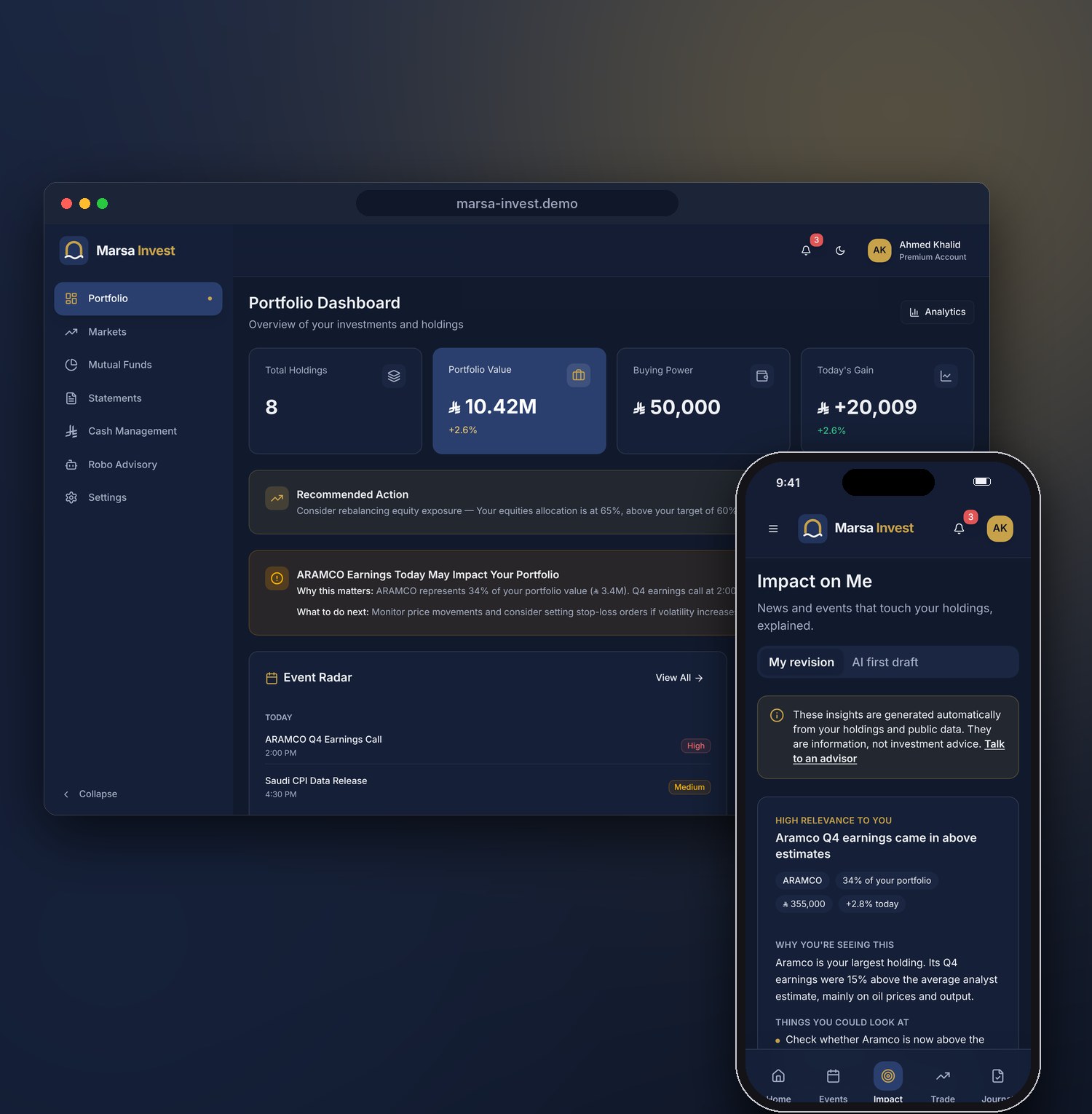
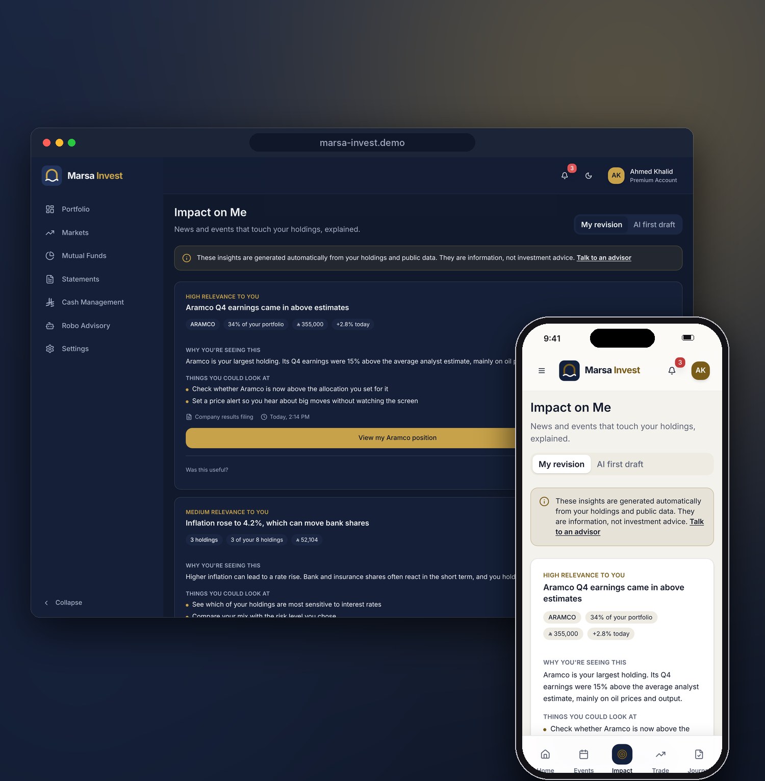
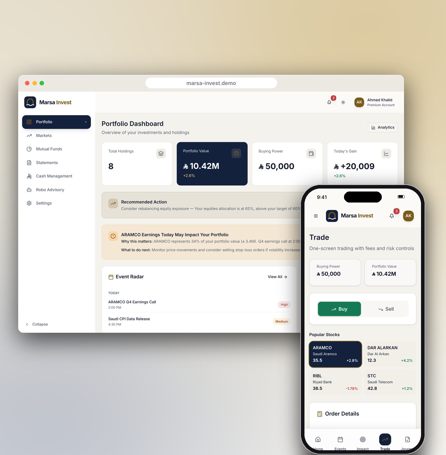
Portfolio, trading, cash and advice in one place, on desktop and mobile.
Lead UX/UI Designer, working on my own. I framed the product, directed the AI, reviewed its output and presented to the client.
A unified investing and trading platform: portfolio, markets, funds, trading, cash, statements and three AI-driven features, on desktop and mobile.
Pitched as a working, clickable prototype one week after the brief.
The short version
- The problemInvestors jump between separate tools to check their portfolio, trade, move cash and read statements. The brief asked for one client experience.
- My approachFrame the product first, then use AI to build it fast, and spend my own time where AI is weakest: judgement, trust and regulation.
- What I deliveredA clickable platform with 15 screens, light and dark themes, a mobile layout, and three AI features: Impact on Me, Event Radar and Robo Advisory.
- The resultBuilt and presented in one week. The client was very impressed and shortlisted the proposal.
- What it showsAI made the build fast. The value I added was knowing what to ask for and what to reject.
A brokerage with its services spread across too many places
The client is the investment arm of a Saudi bank. Its clients trade on the Saudi exchange, hold mutual funds, move cash and read statements, and each of these lived in a different place. The brief was a single "unified client experience".
A pitch is judged in a meeting, not in a document. I decided early that the client should click through a working product rather than look at static slides, and that decided how I would work.
About this caseThe client is described generically and the product is shown under a placeholder brand, Marsa Invest. Company names on the exchange are public. All figures are sample data. The demo is the prototype I pitched, rebranded, with the review fixes described below.
The challenge
Show a whole platform, not a few screens, in one week, as one designer.
- Cover the full client journey, from signing in to placing a trade and reading the result.
- Make AI useful to investors without it sounding like investment advice, in a regulated market.
- Make it feel real enough to win the room, working in light and dark and on a phone.
My role and the scale of the work
I led the pitch end to end: I defined what the platform needed, decided what to build first, directed the AI, reviewed everything it produced and presented it to the client.
How I worked with AI
I used Figma Make, which generates a real React app from prompts. The tool writes the code quickly. Deciding what to build, and what to change, stays with the designer.
- FrameI turned the brief into the platform's structure: five client jobs, the areas they need and what to build in depth.
- GenerateFigma Make turned my descriptions into a working React app.
- ReviewI went through every screen as a designer and as a client would, looking for gaps, errors and risk.
- RefineI fixed what the AI got wrong, through prompts or by hand.
- PresentI walked the client through the working product, not slides.
Framing the platform before the first prompt
Before generating anything, I grouped everything a brokerage client does into five jobs. Each job became an area of the platform, and each area got the screens it needed. That map, not the AI, decided what was built.
- Portfolio dashboard
- Holdings
- Analytics
- Activities
- Markets
- Mutual funds
- Event Radar AI
- Trade
- Trade journal
- Cash management
- Impact on Me AI
- Robo Advisory AI
- Statements
- Sign in
- Settings
Built in depth: trading and the three AI features, where trust is won or lost. Everything else was built wide enough to click through.
Left out on purposeAccount opening and identity checks, live market data and a full advisor chat. They matter for launch, but they would not change the client's decision in a pitch.
Try it yourself
The demo below is the platform itself. Everything is clickable and runs on sample data.
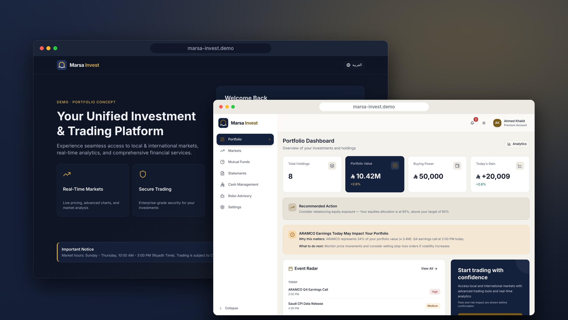
Marsa Invest, live demo
Sign in with the pre-filled details, then try these:
- Open Impact on Me and switch between my revision and the AI's first draft.
- Place a trade and watch fees and risk update as you type.
- Switch between light and dark, or open it on your phone.
One platform for the whole client journey
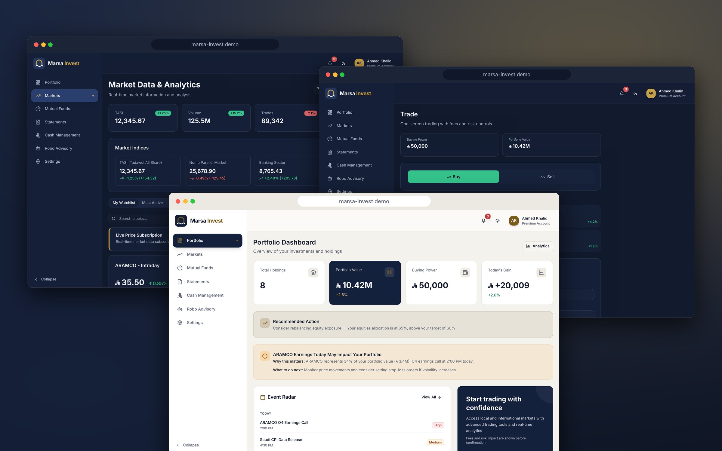
The portfolio dashboard is the home: total value, today's change, buying power and what needs attention, with links into every area. Markets, mutual funds, trading, cash and statements each have their own space, and the same navigation reaches all of them.
Trading sits on one screen, with fees, VAT and position size shown before the order goes in, so the investor sees the full cost and risk first.
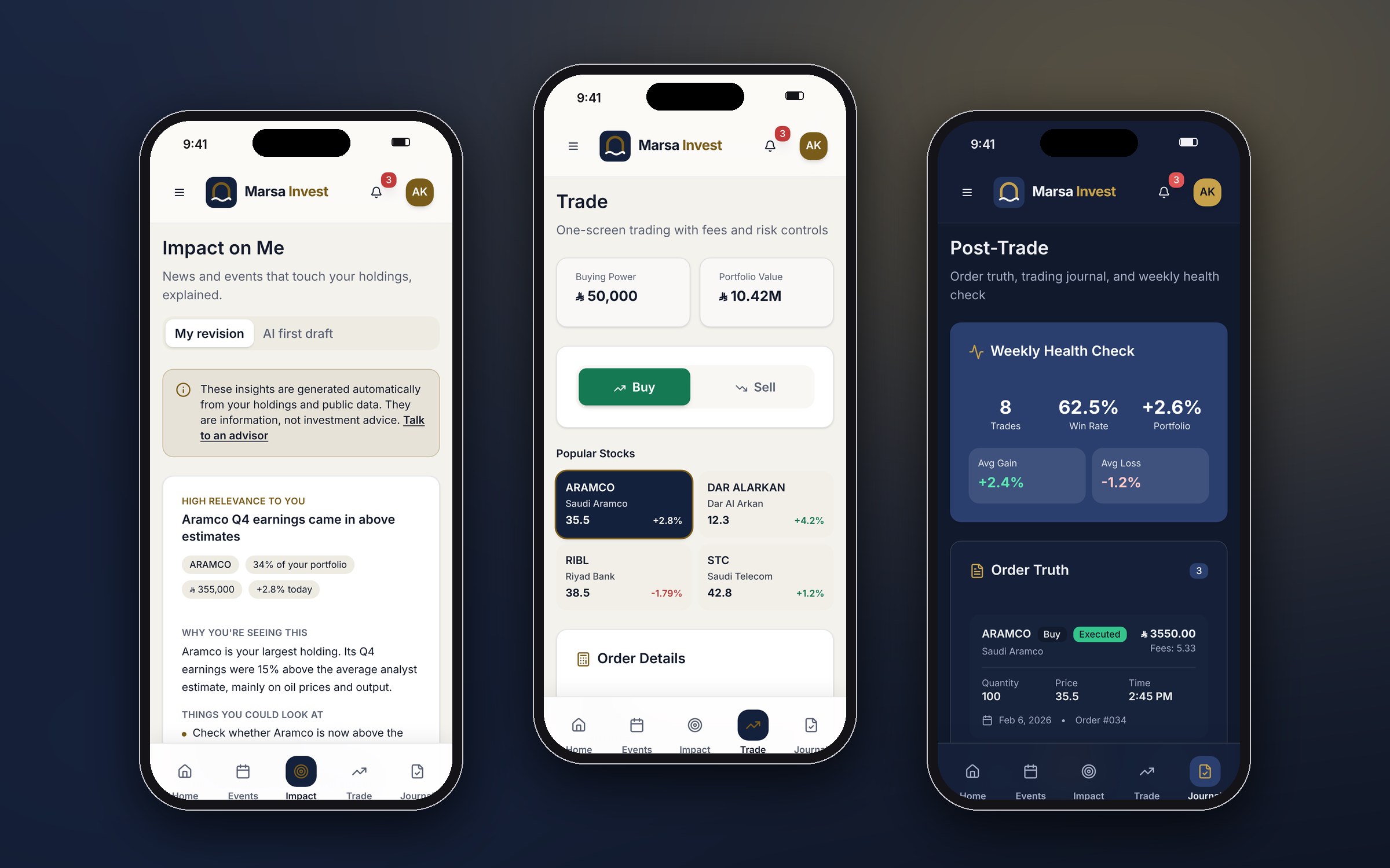
On a phone, the sidebar becomes a bottom bar with five shortcuts for checking in on the go: home, events, impact, trade and the journal.
Designing AI that investors can trust
Three features use AI to turn market noise into something personal. They are also where AI design can go most wrong: in a regulated market, a suggestion that sounds like advice is a risk for the client and the investor.
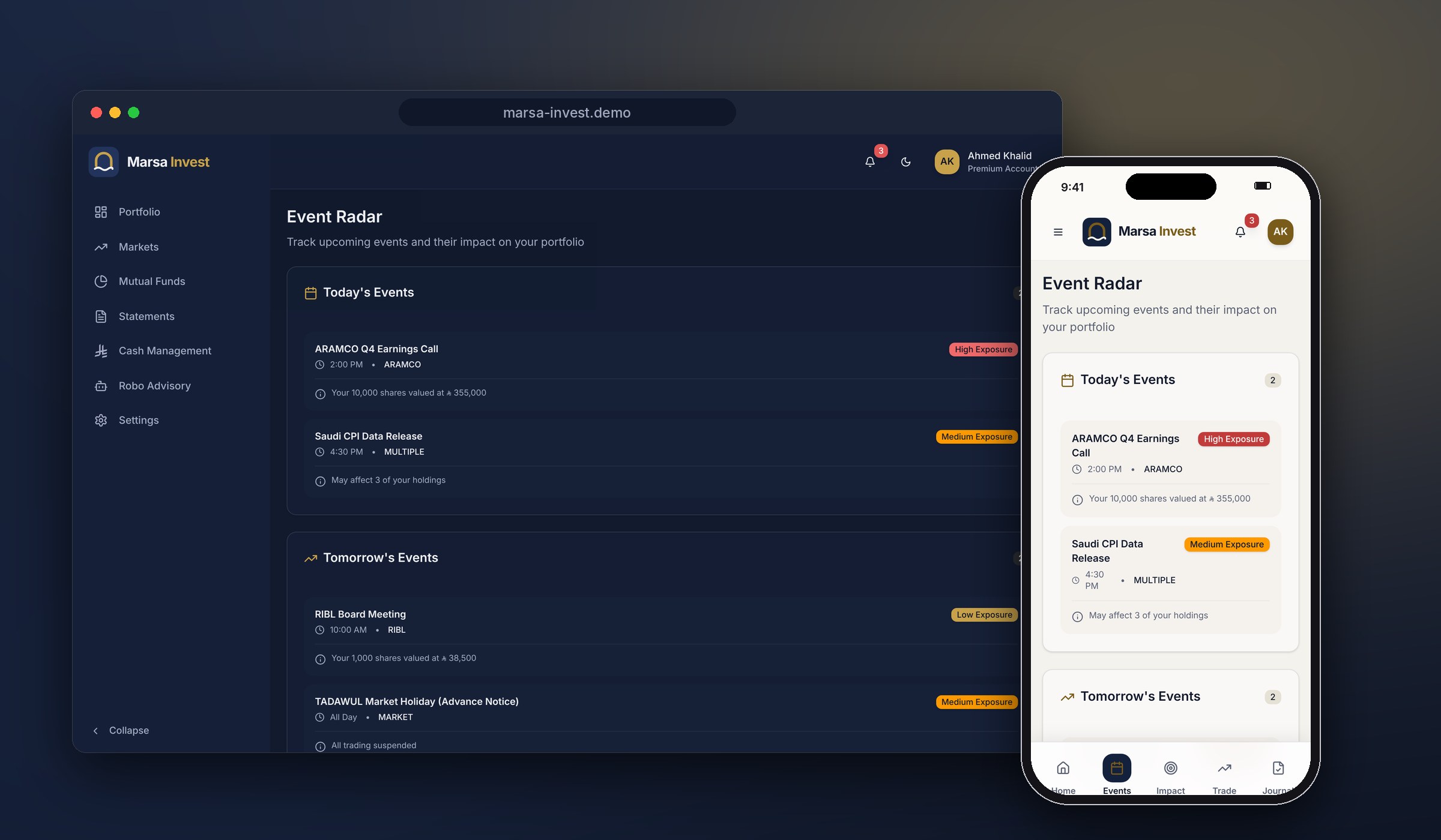
- Impact on MeExplains news and events that touch your holdings: why you are seeing it, and what you could look at.
- Event RadarLists earnings, data releases and market holidays, ranked by how much of your money they touch.
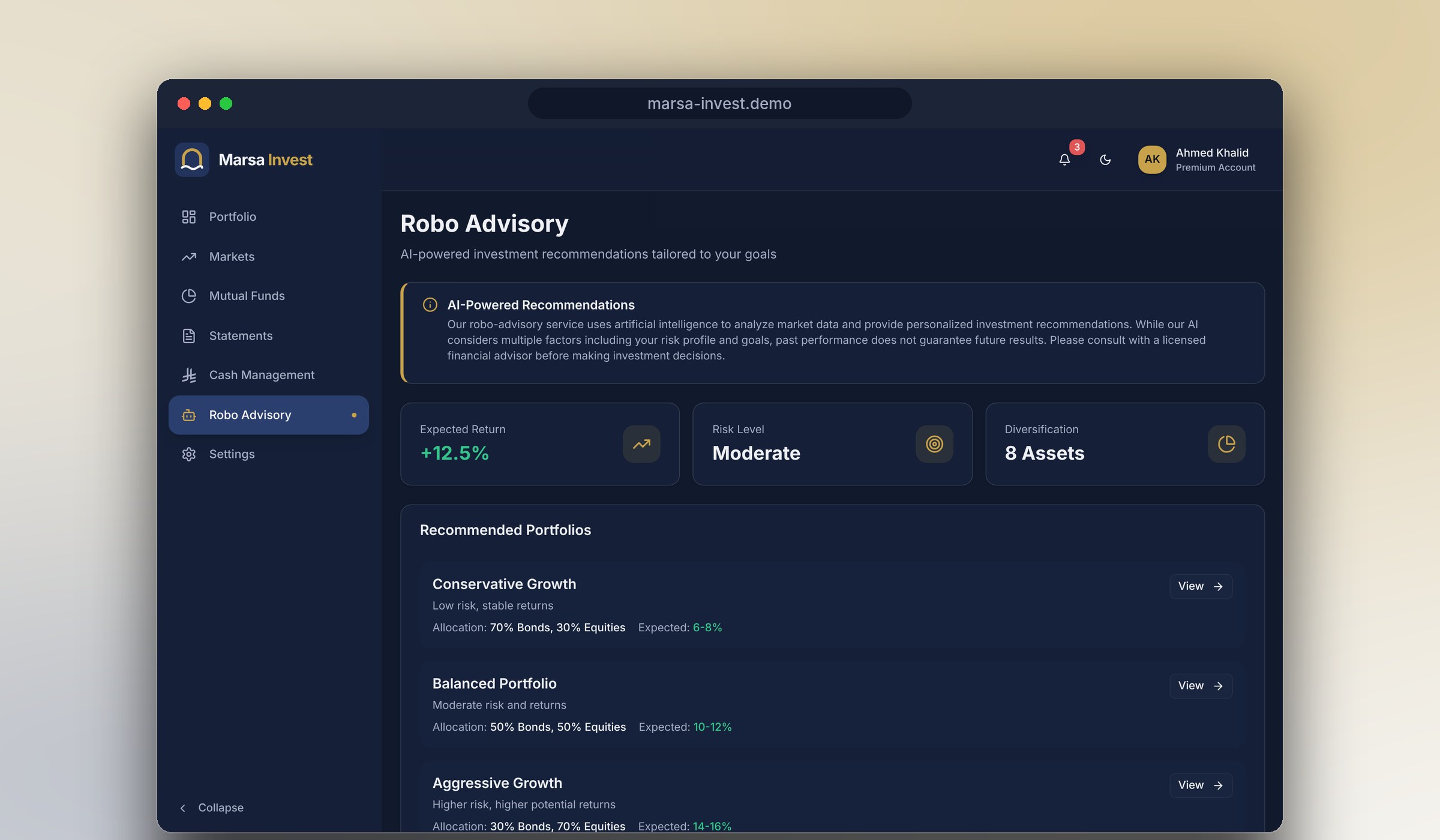
- Robo AdvisorySuggests model portfolios for your risk level, with a clear disclaimer.
Where I overruled the AI
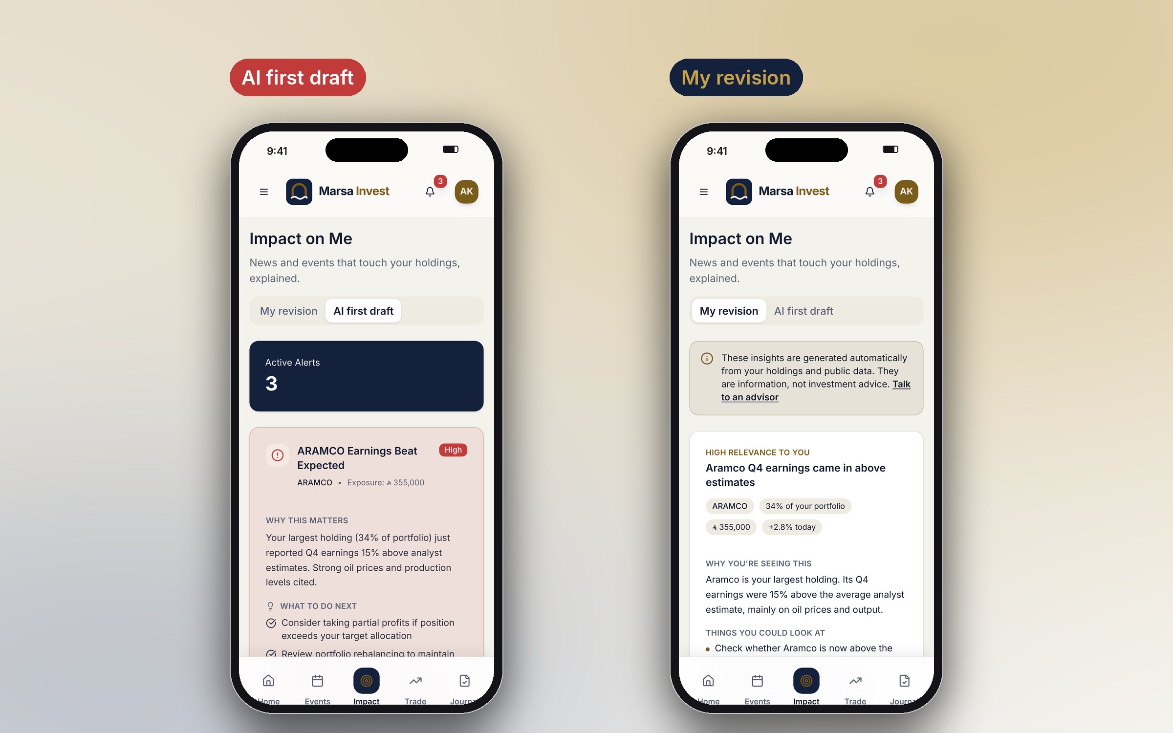
The AI's first draft of Impact on Me told investors to "consider taking partial profits" and "set protective stop-loss orders", with red and green buttons that pushed them to act. It read like a broker's tip, with no source and no disclaimer. I rewrote it around four rules:
- Explain, don't instruct. "What to do next" became "Things you could look at", written as options, not orders.
- Show where it came from. Every insight names its source and time.
- Say what it is. A note says the insights are information, not investment advice, with a route to a human advisor.
- Learn from the investor. "Was this useful?" lets people tune what they see.
Reviewing the generated code turned up smaller problems too. None of them would show in a quick look, and every one would cost trust in front of a client.
| What the AI produced | Why it matters | What I did |
|---|---|---|
| A stock ticker labelled with the wrong bank's name | Investors spot wrong market data instantly | Checked every company name and ticker against its listing |
| "3 active funds" on one tab, "You haven't invested in any funds yet" on the next | Contradictory numbers break trust in a finance product | Flagged it as a data rule: one source for every count |
| Cash icons faded to almost nothing | The AI faded the whole icon box, not just its background | Rebuilt the tint so the icon stays readable |
| Neon heat-map colours outside the palette | Hard-coded colours ignore the theme and fail in light mode | Tied the scale to the market colour tokens |
| "Swipe to submit" written under a button | Copy that does not match the control confuses people at the moment of paying | Replaced it with a line about checking fees before confirming |
| The AI disclaimer on one page only | Every AI suggestion needs the same framing | Added it where AI insights appear |
Light, dark and a brand that fits
For this portfolio I rebranded the platform as Marsa Invest, from the Arabic for harbour: a calm, safe place to keep your money. The palette is midnight navy with a brass accent, chosen for a private-banking feel rather than the bright greens of trading apps.
Because the generated code used design tokens, the whole platform took the new palette by changing the tokens, not the screens. Light-mode brass was darkened for text so labels stay readable.
Design decisions
Show, don't tell
A working product in the meeting beats any number of slides. The client saw the platform working, not described.
Breadth first, then depth
The AI built every area quickly, so I could spend my time on the parts that decide trust: AI insights and trading.
Real market, sample numbers
Real Saudi-listed companies and riyal amounts written with SAMA's new riyal sign, so the client recognised their own market at a glance, while every figure stayed sample data.
Cost before commitment
Fees, VAT and the order's share of the portfolio are on screen before the order button.
Mobile is its own job
On a phone, investors check in rather than research, so mobile gets a bottom bar of shortcuts instead of a shrunken desktop sidebar.
Review AI like a junior's work
Fast and capable, but checked line by line before anyone outside the team sees it.
How I would scale this to a team
I worked alone on this pitch and owned every call: what to build, what to leave out and what to reject. Here is what I learned, and how I would bring the same way of working to a design team.
- Write the rules firstOn this pitch I left Figma Make's guidelines file empty, and several errors in the table above came from the AI guessing: colours outside the palette, a disclaimer on one page only. A team should start with a shared guidelines file: the tokens, chart colours, how AI insights are worded and what the AI must never say.
- Review before anyone sees itA short checklist for every generated screen: real data, consistent numbers, accessible contrast, copy that matches the control, and no advice language.
- Know when not to use itAI is strong at breadth and speed. Research, regulated wording and final visual quality still need a designer's judgement.
- Prototype as a team sportA working prototype gives product, engineering and the client one thing to react to, so feedback arrives in days, not weeks.
How I would measure success
As a pitch, there are no results to report. These are the measures I would propose to the client, each tied to a goal in the brief.
| Goal | What I would measure | Why |
|---|---|---|
| One place for everything | Share of monthly active clients who use three or more areas: portfolio, trading, cash and statements | The brief was to end the jumping between tools. If clients still use one area only, the platform is not unified in practice. |
| Fewer "where do I find…" moments | Support contacts about finding statements, cash transfers or order status | A unified platform should cut the questions that a scattered one creates. |
| Confident trading | Order completion rate, from opening the trade screen to confirming | Shows whether showing fees and risk upfront helps people finish an order. |
| No surprises after a trade | Orders cancelled or disputed over fees within a day | Tests the "cost before commitment" decision directly. |
| AI that helps | "Was this useful?" rate on Impact on Me and Event Radar | The investor's own signal that an insight was relevant, not noise. |
| AI that informs, not pushes | Trades placed within minutes of reading an AI insight, watched as a guardrail | A sharp rise would suggest insights read as tips. It should stay flat while usefulness goes up. |
| Safe in a regulated market | Compliance flags on AI wording, and complaints that mention advice | The target is zero. Any flag means the wording rules need tightening. |
From pitch to production
A one-week prototype proves the experience, not the product. Taking it to launch would need four more steps.
- Test with investorsOne week left no time for research. Usability tests with the bank's clients come first, starting with trading and Impact on Me.
- Compliance sign-offEvery AI message type, disclaimer and advisor route reviewed against the regulator's rules before launch.
- Real dataA licensed market data feed and the bank's account, order and cash systems in place of sample data.
- Rebuild, not shipThe generated code proves the experience. Engineering would rebuild it on the bank's stack, reusing the same design tokens.
Outcome
I presented the working platform one week after the brief. The client was very impressed and shortlisted the proposal.
What the project shows is how I lead with AI: frame the problem myself, let AI do the heavy lifting, and stay accountable for every screen it produces, especially where trust and regulation are involved.
More Projects
Like what you see?Let's discuss your next project.
Chat on WhatsApp (opens in a new tab)