
Case study · Health product · 2026
A family health app built around three moments that matter
A patient app that hospitals and clinics can brand as their own, framed and built with AI by three designers in a five-day workshop.
Your guide is Dr. Pilly, Kin’s cartoon health assistant and not a real doctor. He narrates the case study as you scroll.
Scope of work
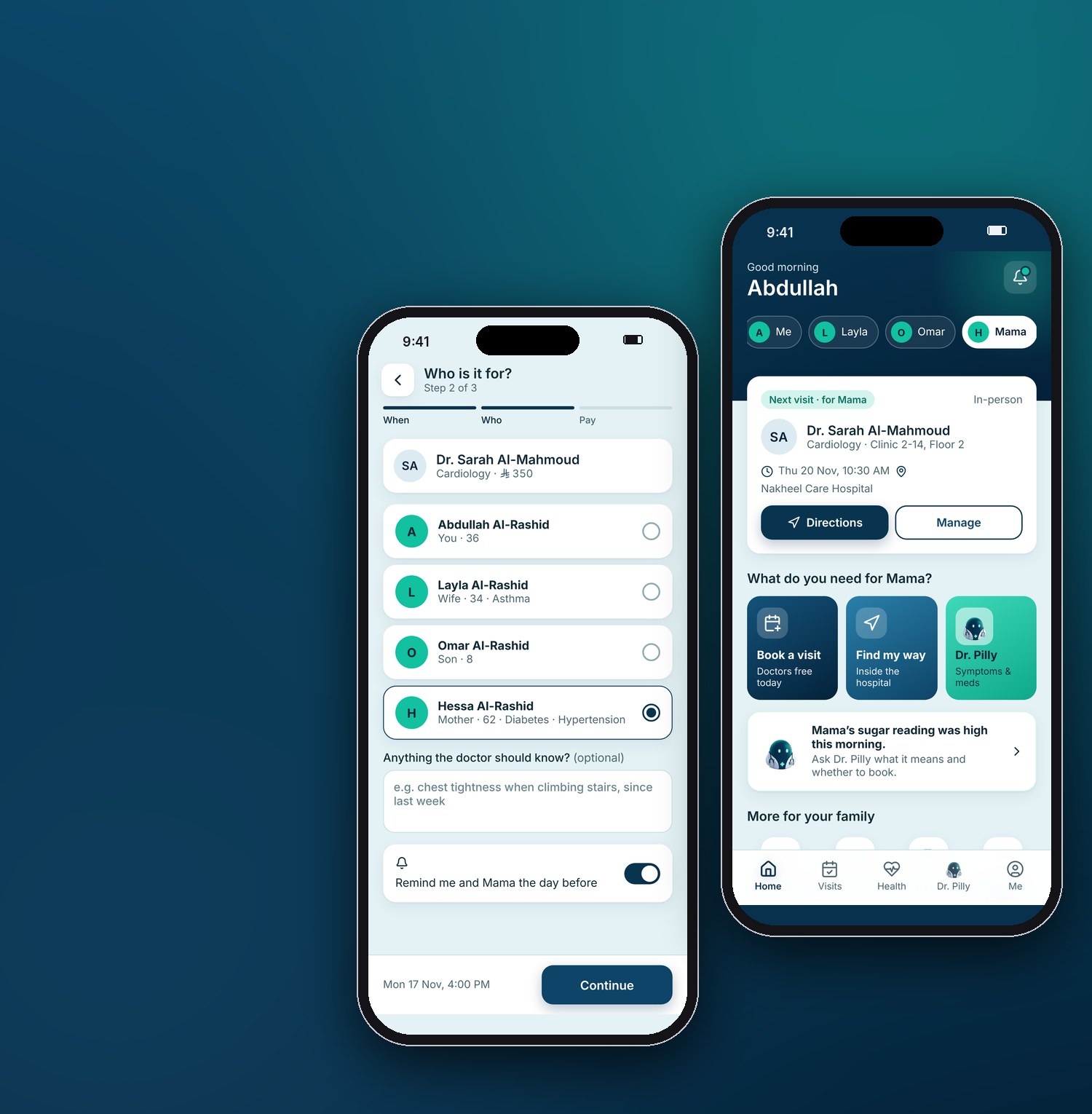
Book a visit for yourself or anyone in your family, in three steps.
Lead UX/UI Designer. I ran a five-day workshop with a senior and a junior designer, led the AI work and reviewed everything we shipped.
A bilingual patient app: 16 flows, with three journeys taken to depth: booking, wayfinding and a health assistant.
A working product prototype, ready to demo to hospitals and clinics.
About this caseShown under a placeholder brand, Kin. Every name, doctor, hospital and figure is fictional.
My role, the team and the scale
Three designers, five days, every decision made together. We built in Figma Make, which turns written briefs into a working app; I wrote the briefs, the refinement prompts and the assistant’s safety rules.
How I led, one exampleOn day two the first build showed the assistant as a real doctor. I paused the build and put the risk to the team, and we agreed three rules together: a danger check first, no doses in chat, and “not a real doctor” on every screen. I turned them into the next prompt and a review checklist, and we checked every assistant screen against it before moving on.
- FrameWho it’s for, and the moments that matter.
- Brief16 flows with every edge case, then the first build.
- ReviewUsed it as patients would, and read the code.
- RefineRounds of fixes, each with a checklist.
- FocusThree journeys taken to depth.
Research: what patients already use, and who we designed for
Our research was desk-based, on day one of the workshop: public app listings, the health apps we use ourselves, and Saudi rules for health software. Talking to patients and carers is the next step.
What patients already use
| What exists | What it does well | Where it stops | What we took |
|---|---|---|---|
| Sehhaty, the national health app | Booking at national scale, in person and by video, with dependents and children’s vaccines | Public care. It doesn’t guide you once you’re inside a private hospital | Treat the family as the user |
| Private hospital group apps | Booking, family files, results and insurance approvals in one account | Family sits in a menu, and help ends at the car park | “Who is this for?” as a booking step, and guidance to the clinic door |
| Telehealth apps | A video visit in minutes, medicines delivered | Separate from the hospital you visit in person | Video visits in the same app as in-person care |
| Global symptom checkers | An answer for any symptom, any hour | Long lists of causes, a frightening tone, no link to local care or 911 | A danger check first, then a real doctor nearby |
The gapNo one covered the whole visit. Booking, the walk inside the building and the worry between visits lived in different apps, or nowhere.
Who we designed for
Four people: the family carer, the older patient, the Arabic-first patient and the midnight searcher.
HypothesesNo patient interviews were part of the workshop, so these are working profiles drawn from the desk research and our own families. Testing would confirm or replace them.
See the four profiles
The family carer
Wants: to book and drive for parents and children without juggling accounts.
Needs: a “who is this for?” step and everyone’s visits in one place.
The older patient
Wants: to arrive on time without asking for directions.
Needs: large type, step-free routes and a map that works without the camera.
The Arabic-first patient
Wants: an app that feels made in Arabic, not translated.
Needs: right-to-left layouts and the medical words people actually say.
The midnight searcher
Wants: to know if a symptom is serious, without being scared.
Needs: a quick danger check, plain words and one clear next step.
How might we…
- …let one person book for the whole family without switching accounts?
- …get a patient from the car park to the clinic door without asking anyone?
- …answer a worried question at midnight safely, and know when to say “call 911”?
- …make Arabic feel native from the first screen?
Three moments patients remember
We grouped every flow by when a patient needs it and took one journey from each moment to depth. “Who is this for?” runs through all three.
- Book an appointment
- Find a doctor
- Payments
- Find your way inside
- Video visit
- Check in
- Ask Dr. Pilly
- Results
- Health tracker
- Family
- Messages
- Settings
Why these three
- BookingThe job every app we looked at is built around, and the one carers do most for others.
- WayfindingThe gap no app covered. Getting lost makes patients late, and late patients cost clinics their slots.
- The assistantThe riskiest moment, so it needed the most design care.
Try it yourself
The demo is the whole app on sample data. On a computer it opens in a phone frame with a guide beside it; on a phone it fills the screen.
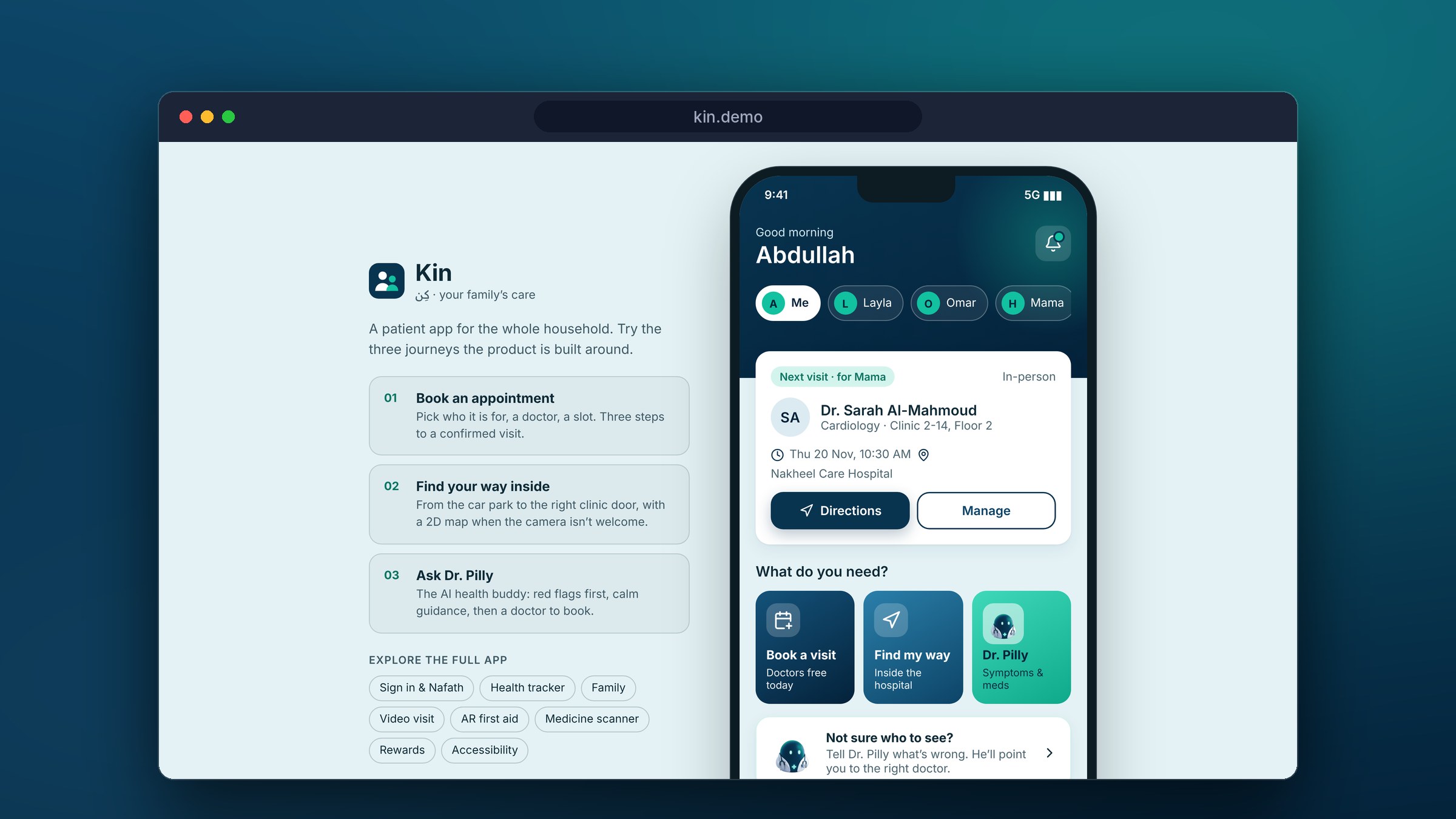
Kin, live demo
- Switch to Mama and book her a visit.
- Take Directions and let Dr. Pilly walk you to the clinic.
- Tell Dr. Pilly about a headache, and answer his question both ways.
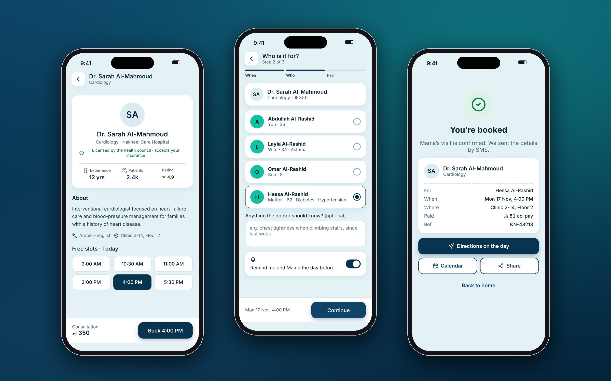
1 · Booking, for anyone in the family
Three steps after choosing a doctor: when, who, pay.
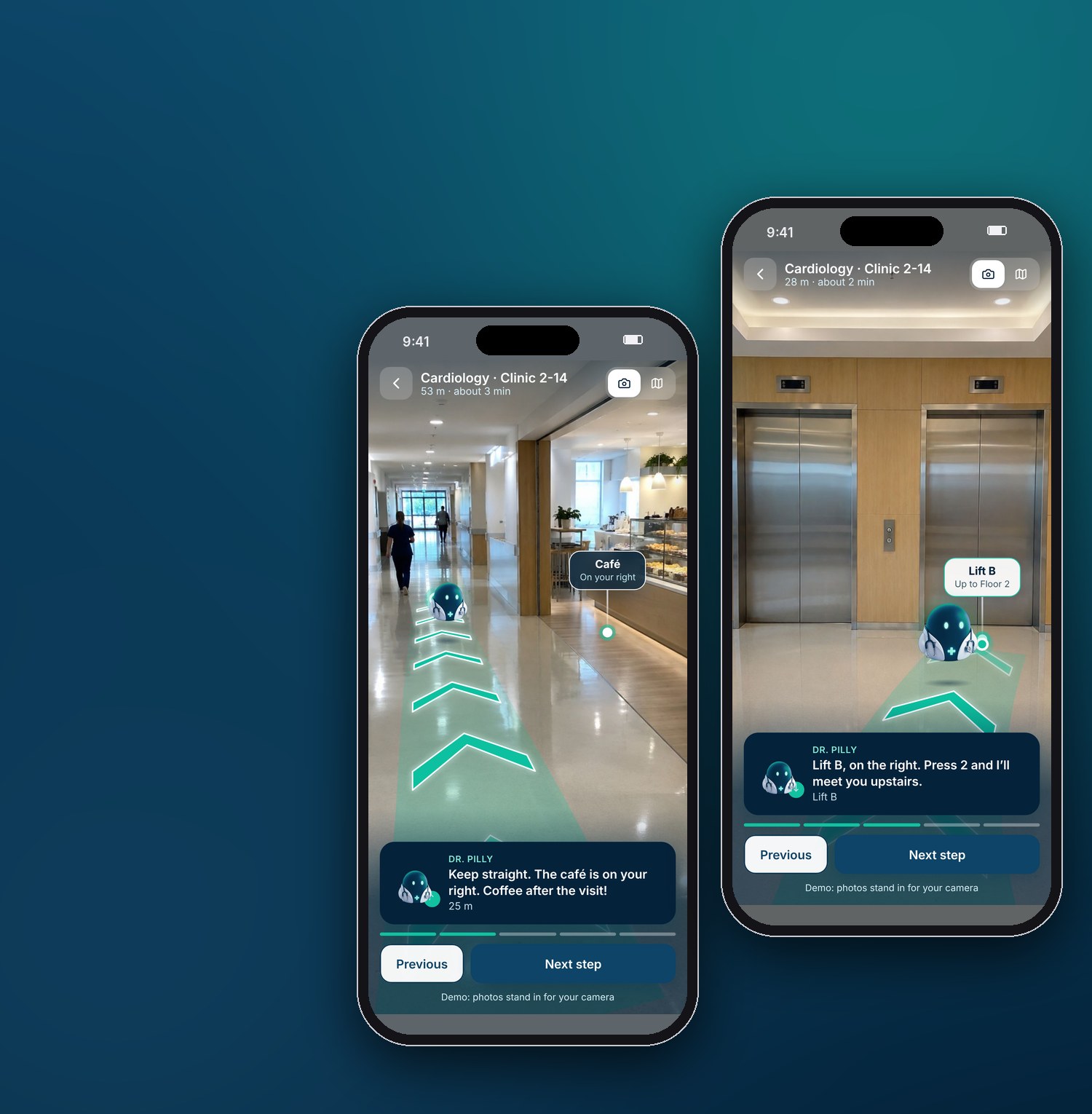
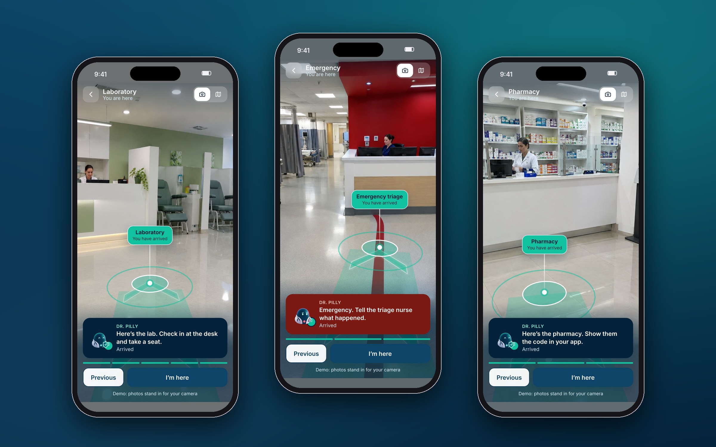
2 · Finding the way, with augmented reality
Hold the phone up and the route appears on the real floor, with Dr. Pilly floating a few steps ahead. It works in all three partner buildings, a hospital, a family clinic and a diagnostics lab, and every destination has its own route and arrival, with a floor map that follows you level by level.
In the demoAI-generated photos of the hospital, clinic and lab stand in for the live camera. The product would use AR tracking and indoor positioning.
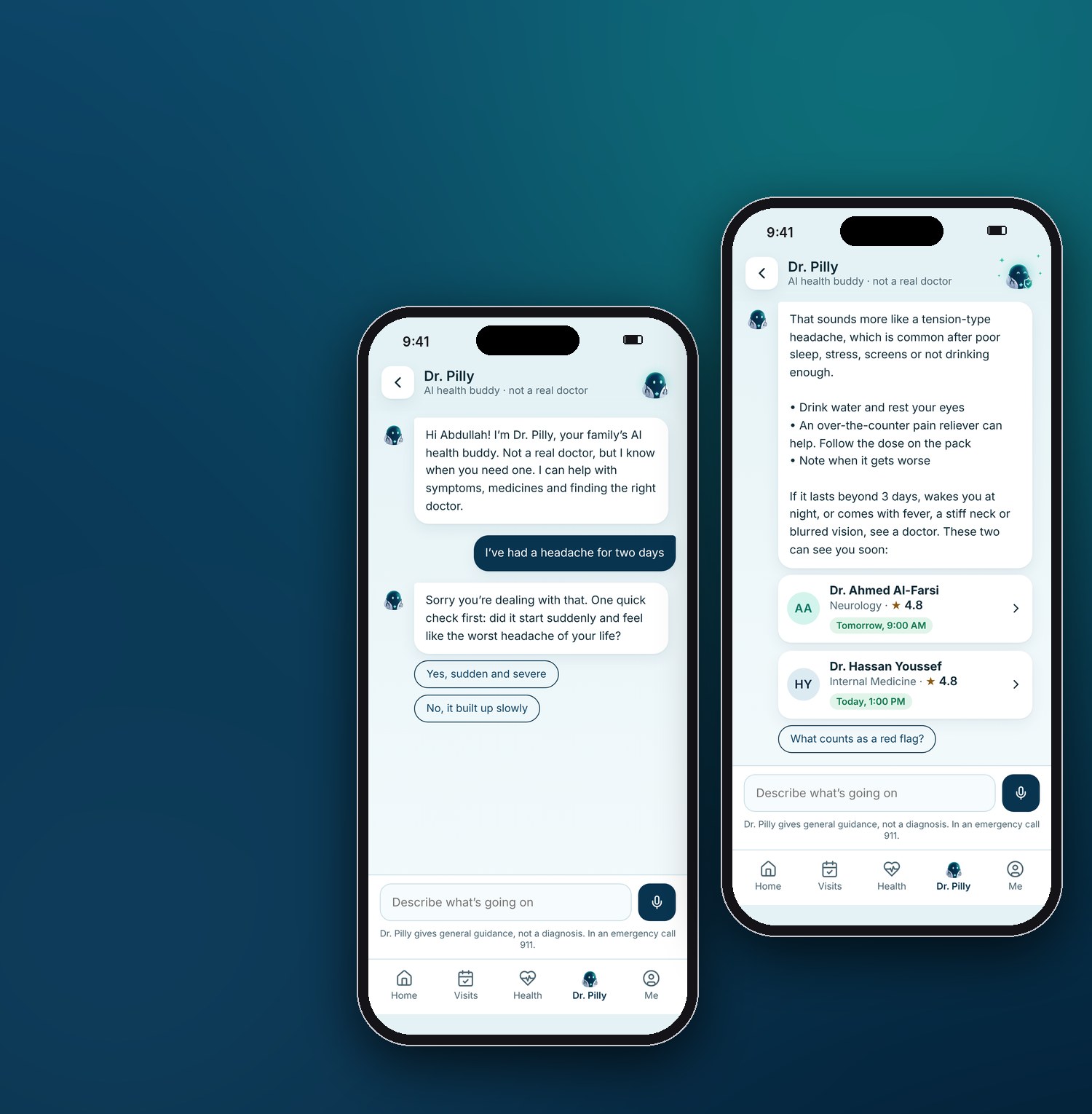
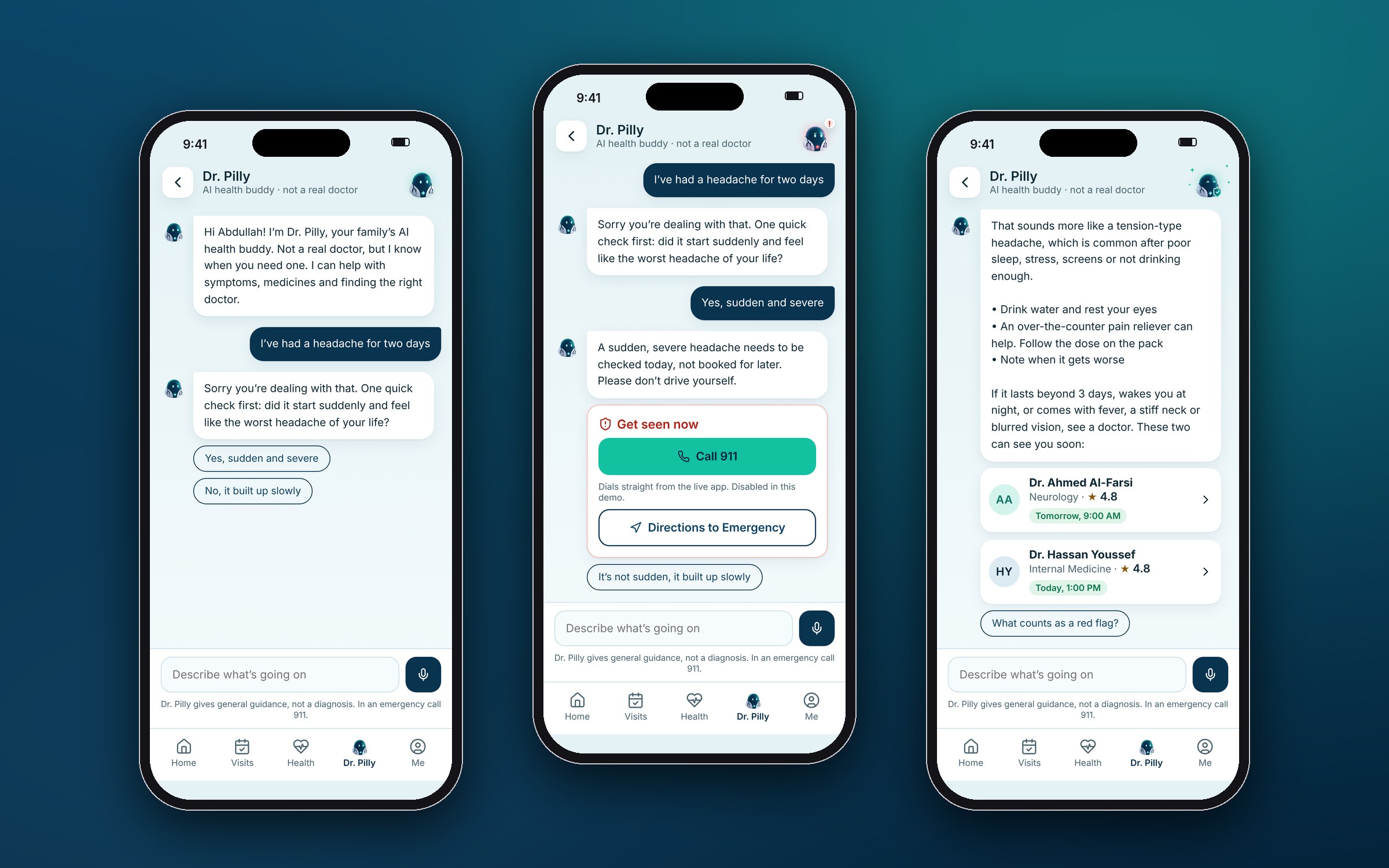
3 · Dr. Pilly, an assistant that knows his limits
Between visits, people search symptoms and scare themselves. Dr. Pilly calms, informs and routes them to real care.
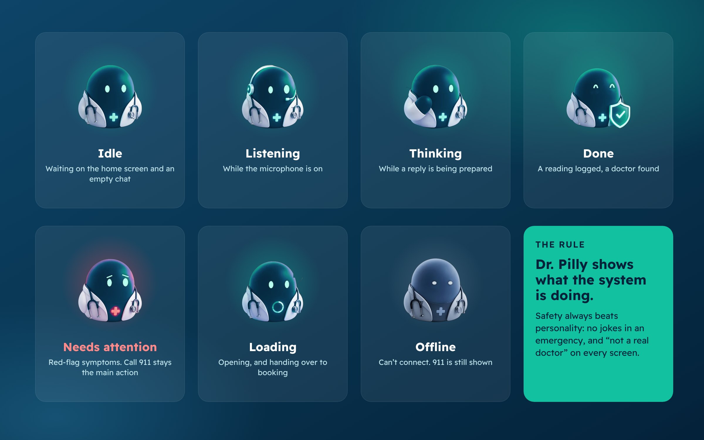
Giving the assistant a face
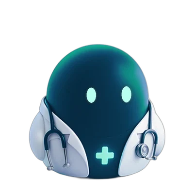
A chat window feels cold when you are worried about your mother, so the assistant got a character. His cartoon name makes it obvious he isn’t a person, and he wears Kin’s navy and mint.
The rest of the app
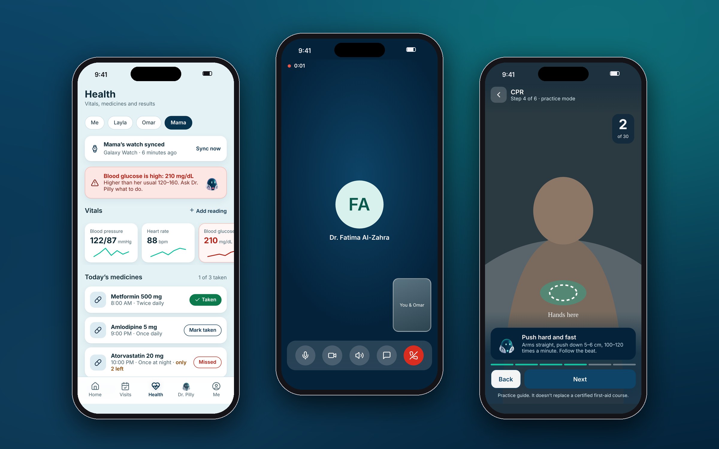
Every flow from the brief works in the demo: Nafath sign-in, health tracker, prescriptions, medicine scanner, video visits, AR first aid, family hub, rewards and accessibility settings.
Where we overruled the AI
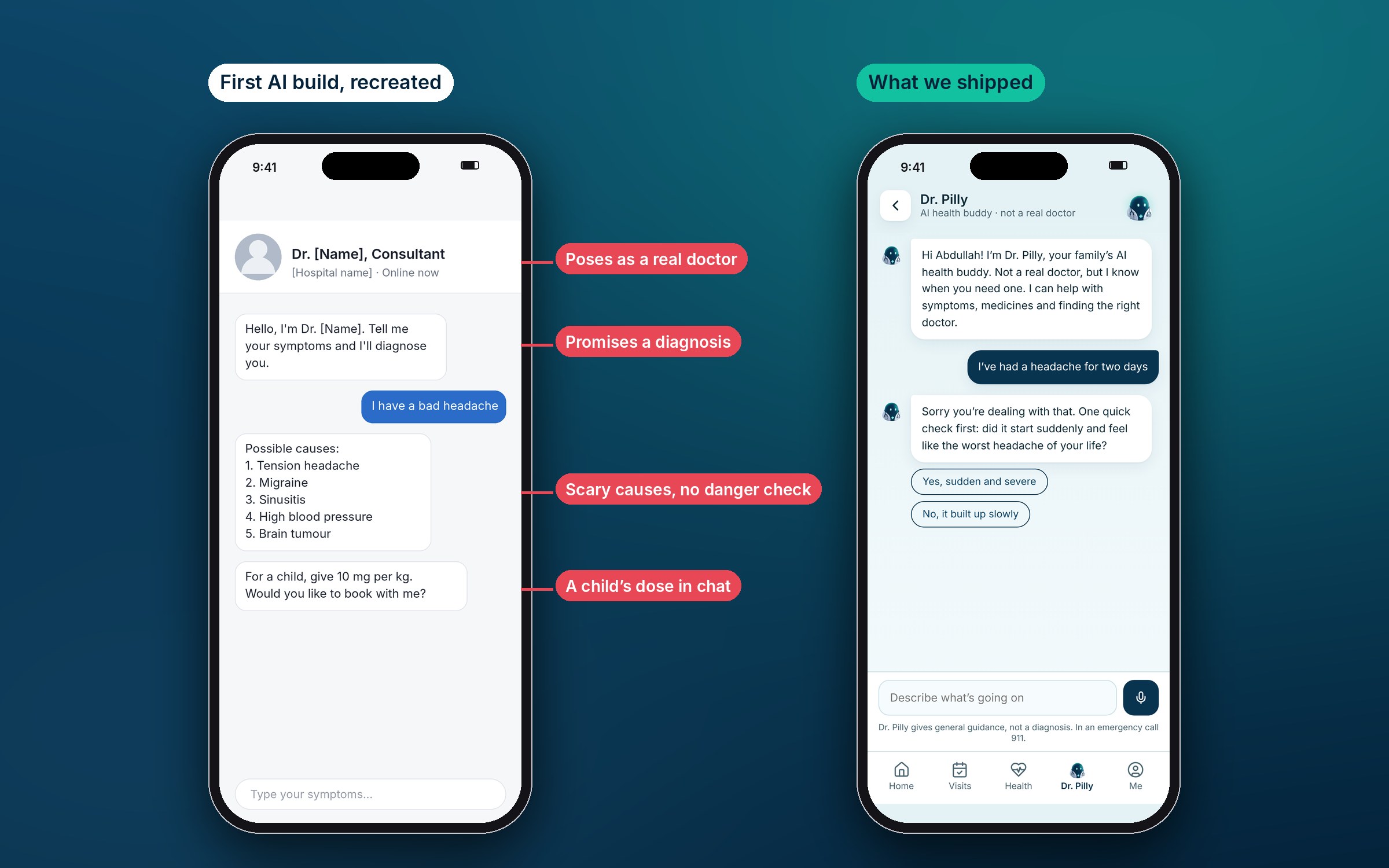
The first build looked helpful and would have been unsafe. These were the calls that mattered most.
| The AI produced | Why it matters | What we did |
|---|---|---|
| An assistant presented as a real doctor from a real hospital | People trust a doctor’s title | An obvious cartoon, “not a real doctor” on every screen |
| Possible causes before any check for danger | A list can delay someone who needs help now | One safety question first, with a route to 911 |
| Children’s doses by weight, in chat | A child’s dose belongs to a pharmacist | Removed. Points to the label and the pharmacist |
| Health figures with no source | Unsourced figures mislead | Removed every figure we couldn’t source |
| Boxes keyboards can’t reach, 2.5:1 grey text | Fails WCAG AA, and many patients are older | Real controls, AA contrast throughout |
Design decisions
The family is the user
“Who is this for?” is a booking step and a home-screen switch, not a buried setting.
Co-pay up front
Fee, VAT and what insurance covers, in riyals, before the confirm button.
Arrows on the real floor
Find the floor first, one arrow style everywhere, labels pinned to real places.
The map isn’t a fallback
A floor map and step-free routes for anyone who won’t or can’t use the camera.
Safety before personality
A danger check before any advice, and no jokes in an emergency.
Journeys hand over
A booking leads to directions, and Dr. Pilly leads to a doctor.
Who pays, and what could go wrong
Kin is sold to hospitals and clinics, who brand it as their own. Here is why a provider would pay, and the risks we’d raise before anyone signs.
Why a provider would pay
- Fewer empty slotsPatients who arrive on time, and reminders that cut no-shows.
- A lighter front deskBooking and “where is the clinic?” move from the phone line and reception to the app.
- Whole familiesOne carer brings a household’s visits to the same provider.
- Their brand, ready madeA tested patient app in their colours, instead of building one from scratch.
How we’d sell itAn annual licence per facility, priced by size, with setup and AR mapping charged per building. That keeps the first contract small and lets AR grow with proof.
Risks and how we’d respond
The big three: the assistant may count as medical software, health data falls under the PDPL, and AR costs money per building.
See all six risks and our responses
| Risk | Why it matters | How we’d respond |
|---|---|---|
| The assistant counts as medical software | SFDA can regulate software that assesses symptoms as a medical device | Keep it to triage and routing, never diagnosis. Confirm its class with SFDA early |
| Health data and privacy | The PDPL sets rules on consent, where data is stored and transfers abroad | Data kept in the Kingdom, consent per family member, guardians only for dependents |
| Liability for advice | One wrong answer could harm someone | Clinical sign-off on every answer, 911 always one tap away, no doses in chat |
| Links to national systems | Bookings, sick leave and insurance approvals run through Ministry and insurer systems | Start with the provider’s own booking system, then add national links one by one |
| AR costs per building | Indoor positioning needs a mapped building and sometimes beacons | Launch with the floor map everywhere, then add AR one building at a time, busiest first |
| A cartoon in a hospital | A mascot can feel unserious to some patients | Test with carers and older patients. Dr. Pilly turns serious in any emergency |
How we’d measure success
The product isn’t live yet, so there are no results to report. These are the measures and starting targets we’d agree with a launching provider.
| Goal | What we’d measure | Baseline | Starting target |
|---|---|---|---|
| Easy booking | Bookings completed after opening a doctor’s profile | The provider’s current app | A fifth higher in 90 days |
| Care for the family | Share of visits booked for someone else | None yet, a new measure | Learn for 90 days, then set |
| On time, without help | Late arrivals and “where is the clinic?” questions at reception | A one-week reception tally before launch | A third fewer in AR buildings |
| Safe guidance | Red-flag chats sent to emergency, and unsafe answers in clinical review | A scripted set of test cases | Every red flag routed, zero unsafe answers |
What we’d test first
- Booking for a parentCan a carer book for their mother without help? Moderated sessions with five to eight carers.
- The danger checkDo people answer the safety question, or skip past it? Scripted scenarios, reviewed by a clinician.
- AR in a real corridorDo older patients hold the phone up, or prefer the map? On site with one partner building.
Outcome
In five days, three designers turned a brief into a working, bilingual product a provider can see in one meeting.
What it provesAI can get a small team to a working product in a week, but only with someone setting the rules and reviewing like an engineer. Our most important work was what we removed.
Next comes testing with patients and carers, clinical sign-off for every assistant answer, then hospital integrations and indoor positioning per building.
More Projects
Like what you see?Let's discuss your next project.
Chat on WhatsApp (opens in a new tab)