
Case study · 2025
Building a unified digital financing experience
A Sharia-compliant digital microfinance platform with a website and an iOS app, built in English and Arabic. I owned the design system, designed three of the app's core journeys and led design for the mobile team, working with business analysts, project management, front end and back end.
Scope of work
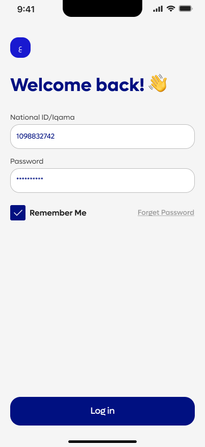
Secure sign-in with national ID and a one-time code.
A journey that starts on the web and ends in the app
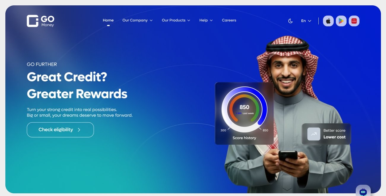
GO Money takes a customer through the whole financing lifecycle: eligibility, application, credit approval and disbursement. The iOS app runs that lifecycle end to end. The website, built on Progress Sitefinity, introduces the product and pre-qualifies customers before they enter the application.
Behind the screens, the platform connects to more than ten national government and service entities and supports a fully digital Murabaha journey that follows Sharia principles and Saudi Central Bank regulation. That context shaped many of the design decisions below.
The challenge
Financing is regulated, and the customer is making a serious decision. The product had to satisfy Saudi Central Bank (SAMA) requirements, work equally well in Arabic and English, and stay consistent across a website, a mobile app and several designers.
- Turn regulatory steps into a flow people can finish.
- Give web and app one visual language, in both languages.
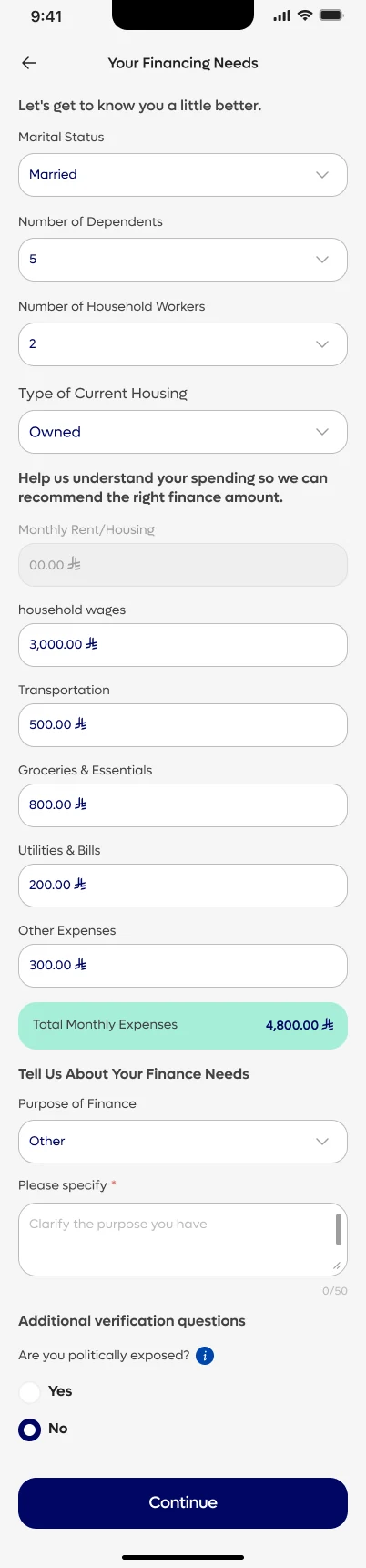
- Help customers understand what they can borrow before they commit.
My role and the scale of the work
I joined as a Senior UX/UI Designer and worked at a lead scope: I owned the design system, designed three core app journeys, and set the design direction for the mobile team.
What I owned
- Design system. One component library for web and app, with every component built in English and Arabic.
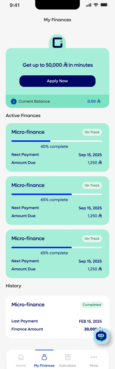
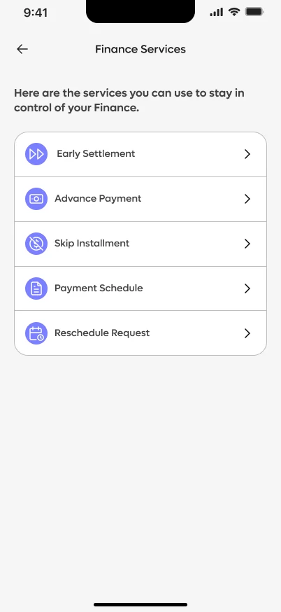
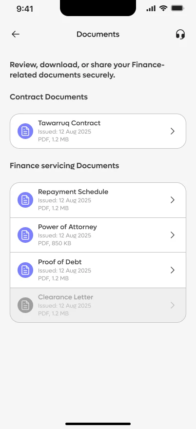
- Three app journeys. Apply for a loan, loan rescheduling, and My Loans with the repayment schedule and loan history.
- Design direction for the mobile team. I coached two junior designers and taught the whole team to use the system.
One design language, two platforms
Rather than separate systems for the website and the app, I built one component library for both. Every component is designed in English and Arabic from the start, and carries the same properties: language, size, type and status. A designer picks one component and gets every state, in either language.
Each component page documents what the component is for, its variants and its version, so designers and developers read the same spec. Pick a component to see how it works in both languages.












Buttons
- Primary, secondary, outlined, text and error types
- Default, hover, pressed, disabled and loading states
- Small, medium and large, with icon-only versions
- 350 variants


Selectors and toggles
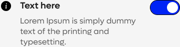
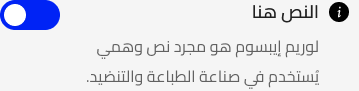
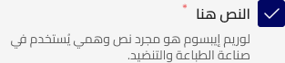
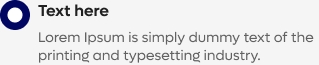
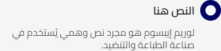
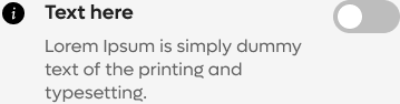
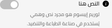
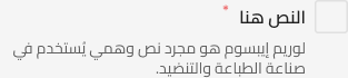
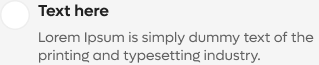
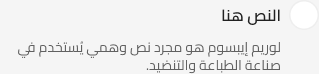
- Toggle, checkbox and radio button
- Default, hover, disabled and error states
- Small, medium and large, with descriptions
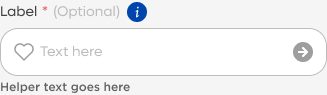
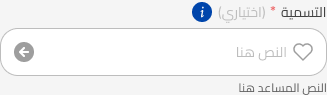
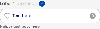
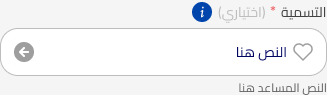
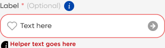
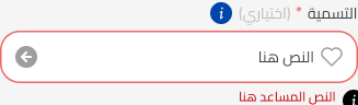
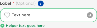
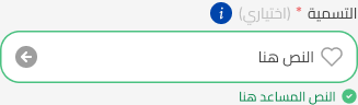
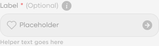
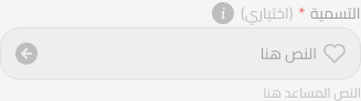
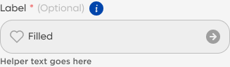
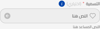
Text, OTP and passcode fields
- Text, numeric, phone, card number and date fields, plus OTP
- Default, filled, error, validation, disabled and read-only
- Small, medium and large
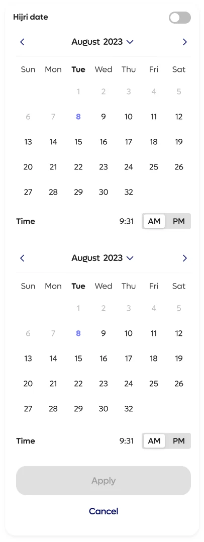
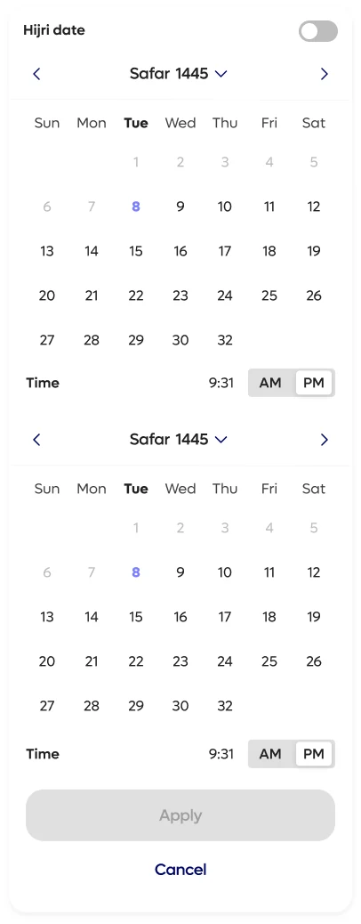
Date picker
- Date, month and year pickers
- Gregorian and Hijri calendars, shown here side by side
- Default, portrait and landscape layouts, with a disabled state
Website experience
The GO Money website is the primary digital introduction to the platform. It explains the value proposition, the financing products and the benefits for customers.
- Clear product messaging and calls to action.
- Financing product information.
- Step-by-step explanations of how the service works.
- Educational content and frequently asked questions.
- App download and payment information.
The site also pre-qualifies customers before they reach the app. Its main feature is the finance calculator, which lets people see what they could borrow and repay before they start an application. I reviewed the website designs for alignment with the design system.

Scroll inside the window to read the full homepage
Mobile app experience
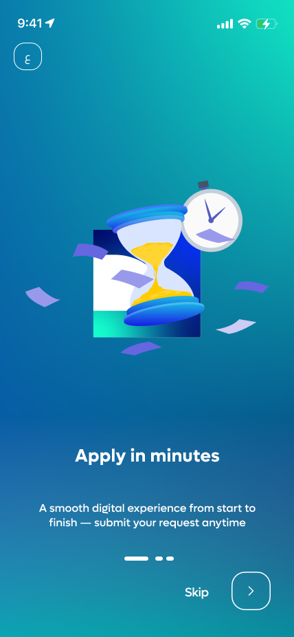
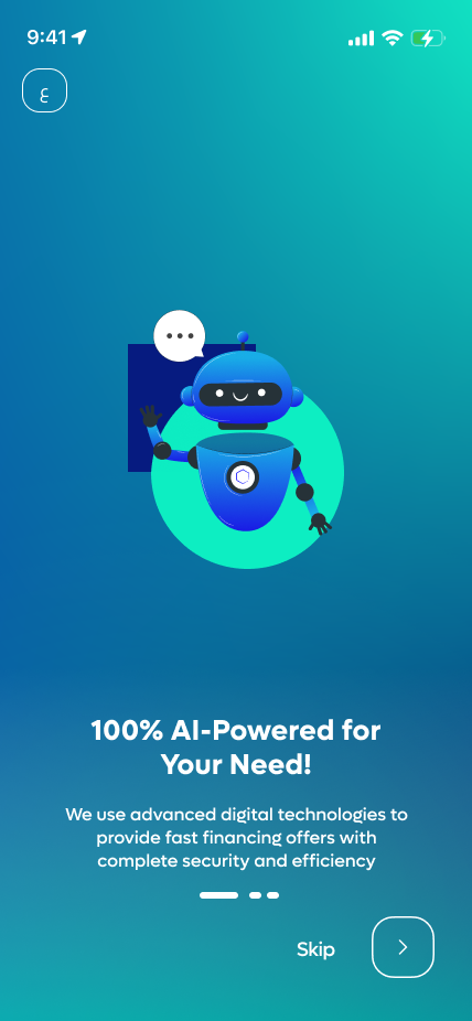
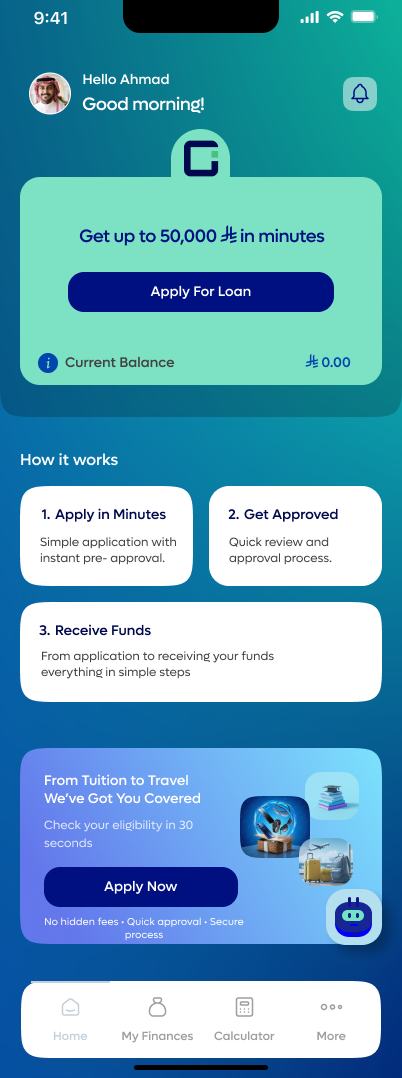
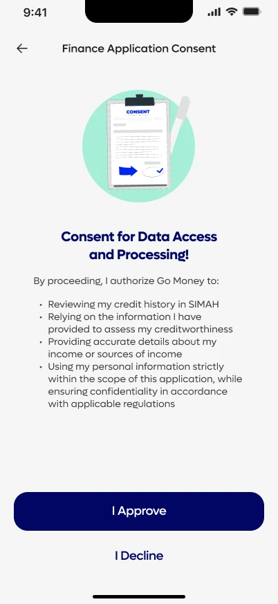
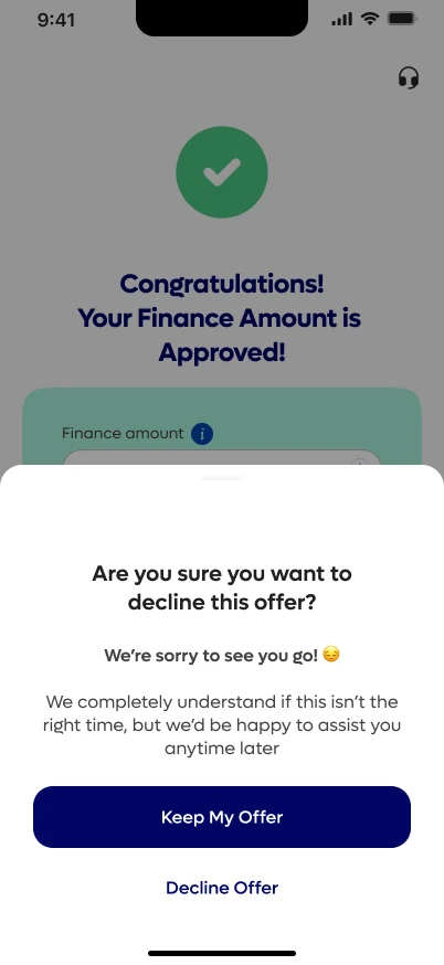
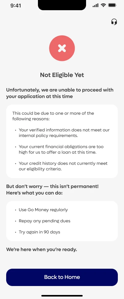
The app gives customers access to digital financing through a simplified, mobile-first experience. I designed three journeys: applying for a loan, rescheduling a loan, and managing existing loans through the repayment schedule and loan history. Every screen exists in English and Arabic.
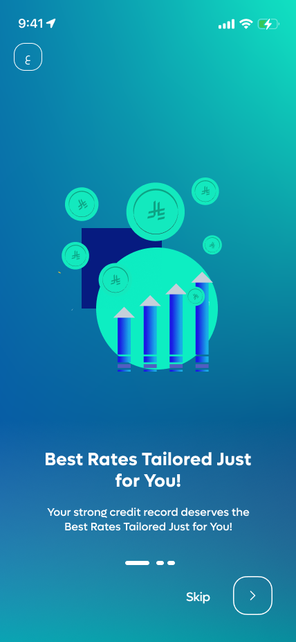
The financing application journey
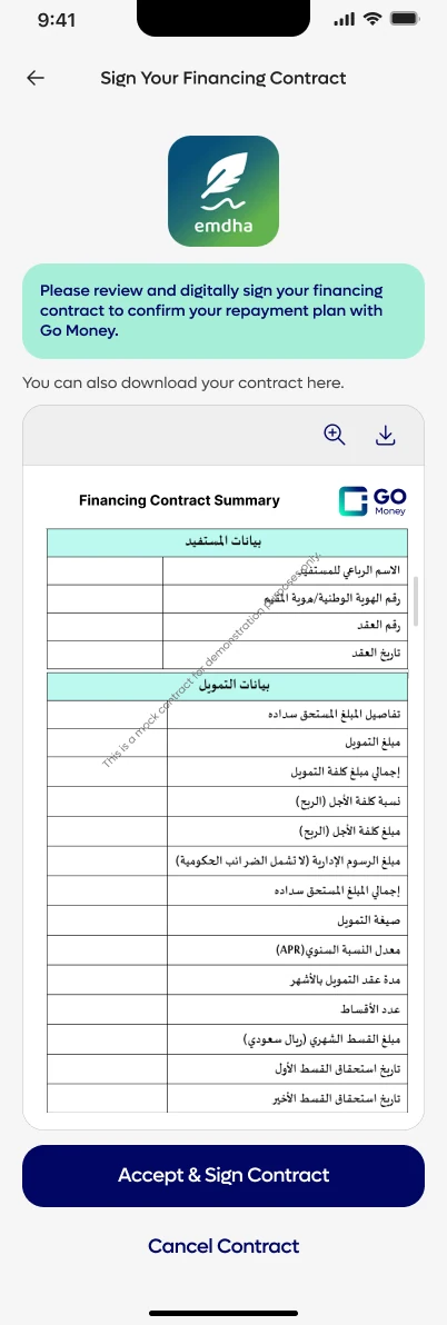
The financing application is the longest journey in the app. SAMA requires several steps before money can be offered: customer consent, a politically exposed person declaration, an eligibility check, identity verification by IVR, the contract and bank details. My job was to place each one where it makes sense to the customer and keep the flow moving.
The prototype below links the real screens from my Figma file. Tap the highlighted area on each screen to move on, then use the buttons beside the phone to branch into the not-eligible, declined offer, invalid IBAN and cooling-period cases.
Sign in
Design decisions
One system for web and app
A customer who starts on the website and finishes in the app should not feel a seam. Shared components and shared tokens made that possible, and meant a fix in one place reached both.
Variants instead of copies
Each component is one object with properties for type, size, status and language. That kept the library small enough to learn and let designers stay consistent without checking each other's work.
Arabic and English together
Each feature was designed in both languages at the same time, not translated at the end. Layout mirroring, text length and number handling were solved inside the components, once.
Regulation inside the flow
SAMA requirements became steps with plain-language explanations, such as the politically exposed person question, which has its own info sheet. Compliance stays visible without feeling like a wall.
Design for the unhappy paths
Errors, rejections and the cooling-period wait were designed on purpose, not left to defaults. A rejection due to debt burden ratio tells the customer they can apply again for a lower amount, and the prototype above lets you trigger the rejection, the decline and an invalid IBAN.
Calculator first, application second
The web finance calculator is the front door. Customers see an indicative amount before they commit to a long application, which pre-qualifies them and sets realistic expectations.
Leading and collaborating
The work crossed many roles, so part of my job was making sure everyone could build from the same understanding.
Coaching two junior designers
I mentored them from user story to flow to finished screens, and reviewed their work throughout.
Teaching the design system
I taught the whole design team to build from the same components, for web and app.
Working across disciplines
Every day with analysts on requirements, project management on scope, and developers on how designs become code.
Recognition
GO Money received Project of the Month recognition from Progress Sitefinity. The feature highlights the project delivered through the collaboration between GO Money and Ejada Systems.
 Sitefinity
User Awards
Winner: Project of the Month
Outcome
GO Money brought a website and a mobile app together into one bilingual experience on a shared design system, and was named Project of the Month by Progress Sitefinity.
What I would point to: a regulated journey that customers can complete, a system that scales across two platforms and two languages, and a team that learned to build on it.
More Projects
Like what you see?Let's discuss your next project.
Chat on WhatsApp (opens in a new tab)